library(ggbreak)
library(patchwork)
library(scales)
library(ggrepel)
library(cowplot)
library(ggplot2)
library(tidyr)
library(dplyr)
library(stringr)
setwd("~/wd/analysis/plot_scripts")
plot_data <- readRDS("plot_data.rds")
Fig 1 - Expression Predictors#
Fig 1A - Expression Predictors#
proportion_by_context <- plot_data$fig_1A
options(repr.plot.width=5.4, repr.plot.height=7)
plot_data_long <- proportion_by_context %>%
  mutate(non_imputable_count = total_count - imputable_count) %>%
  select(context_simp, imputable_count, non_imputable_count)
plot_data_long$context_simp <- gsub("_DeJager_|_ROSMAP_|_Bennett_", " ", plot_data_long$context_simp)
colnames(plot_data_long)[1] <- "Contexts"
plot_data_long <- pivot_longer(plot_data_long, cols = -Contexts, names_to = "type", values_to = "count")
context_order <- plot_data_long %>%
  group_by(Contexts) %>%
  summarise(total = sum(count)) %>%
  arrange(desc(total)) %>%
  pull(Contexts)
plot_data_long$Contexts <- factor(plot_data_long$Contexts, levels = context_order)
plot_data_long$type <- factor(plot_data_long$type, levels = c("non_imputable_count", "imputable_count"))


ggplot(plot_data_long, aes(x = Contexts, y = count, fill = type)) +
  geom_bar(stat = "identity", width=0.5) +
    geom_text(
      data = proportion_by_context,
      aes(x = context_simp,
          y = imputable_count / 2,
          label = paste0(round(proportion_imputable * 100, 1), "%")),
      inherit.aes = FALSE,
      size = 5, angle=90,
      color = "black"
    )+
  theme_minimal() +
  #theme_cowplot(12) +
  theme(axis.text.x = element_text(angle = 50, hjust = 1, size = 16),
        axis.text.y = element_text(size = 16),
        axis.title.x = element_text(size = 21,margin = margin(t = 5)),
        axis.title.y = element_text(size = 21),#margin = margin(r = 1)
        axis.line = element_line(size = 0.7, color = "black"),# Thicker black axis lines
        #legend.title = element_text(size = 17),
        legend.title = element_blank(),
        legend.justification = "center",
        legend.margin = margin(b=5),
        legend.text = element_text(size = 18),
        legend.position="top",
        strip.background = element_blank()
        )+
    # scale_fill_brewer(palette = "PuOr", name = "Category",
    #               labels = c("imputable_count" = "Imputable", "non_imputable_count" = "Non-Imputable"))+
    scale_fill_manual(
      values = c("imputable_count" = "#9ecae1", "non_imputable_count" = "#08519c"),
      labels = c("imputable_count" = "Imputable","non_imputable_count" = "Non-Imputable"),
      name = "Category"
    )+
    labs(y = "Number of Genes", x="Molecular Traits", fill = "Category")
Warning message:
“The `size` argument of `element_line()` is deprecated as of ggplot2 3.4.0.
ℹ Please use the `linewidth` argument instead.”
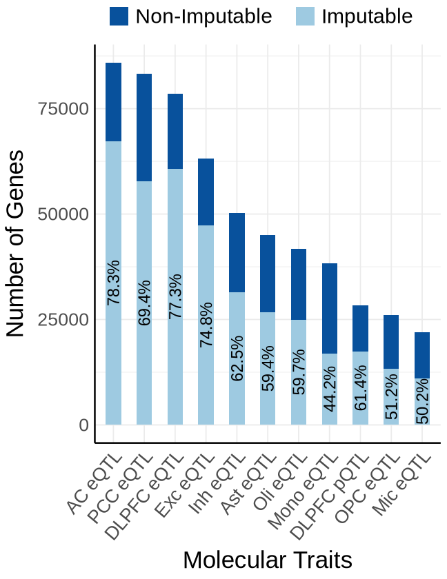
Fig1B#
proportion_by_context <- plot_data$fig_1B
context_order <- plot_data$context_order
options(repr.plot.width=5.4, repr.plot.height=7)
plot_data_long <- proportion_by_context %>%
  mutate(non_imputable_count = total_count - imputable_count) %>%
  select(context_simp, imputable_count, non_imputable_count)
#plot_data_long$context_simp <- gsub("Bennett_", "", gsub("ROSMAP_", "",gsub("DeJager_", "", plot_data_long$context_simp)))
colnames(plot_data_long)[1] <- "Contexts"
plot_data_long <- pivot_longer(plot_data_long, cols = -Contexts, names_to = "type", values_to = "count")
plot_data_long$Contexts <- factor(plot_data_long$Contexts, levels = context_order)
plot_data_long$type <- factor(plot_data_long$type, levels = c("non_imputable_count", "imputable_count"))

ggplot(plot_data_long, aes(x = Contexts, y = count, fill = type)) +
  geom_bar(stat = "identity", width=0.5) +
  geom_text(
      data = proportion_by_context,
      aes(x = context_simp,
          y = imputable_count / 2,
          label = paste0(round(proportion_imputable * 100, 1), "%")),
      inherit.aes = FALSE,
      size = 4.7, angle=90
    )+
  theme_minimal() +
  #theme_cowplot(12) +
  theme(axis.text.x = element_text(angle = 50, hjust = 1, size = 16),
        axis.text.y = element_text(size = 16),
        axis.title.x = element_text(size = 21),
        axis.title.y = element_text(size = 21), #margin = margin(r = 1)
        axis.line = element_line(size = 0.7, color = "black"),# Thicker black axis lines
        # panel.grid.minor.x = element_blank(),
        # panel.grid.major.x = element_blank(),
        legend.title = element_blank(),
        legend.justification = "center",
        legend.margin = margin(b=5),
        legend.text = element_text(size = 18),
        legend.position="top",
        strip.background = element_blank()
        )+
    # scale_fill_brewer(palette = "PuOr", name = "Category",
    #               labels = c("imputable_count" = "Imputable", "non_imputable_count" = "Non-Imputable"))+
    scale_fill_manual(
      values = c("imputable_count" = "#9ecae1", "non_imputable_count" = "#08519c"),
      labels = c("imputable_count" = "Imputable", "non_imputable_count" = "Non-Imputable"),
      name = "Category"
    )+
    labs(y = "Number of Gene-method Pairs",x="Molecular Traits", fill = "Category")
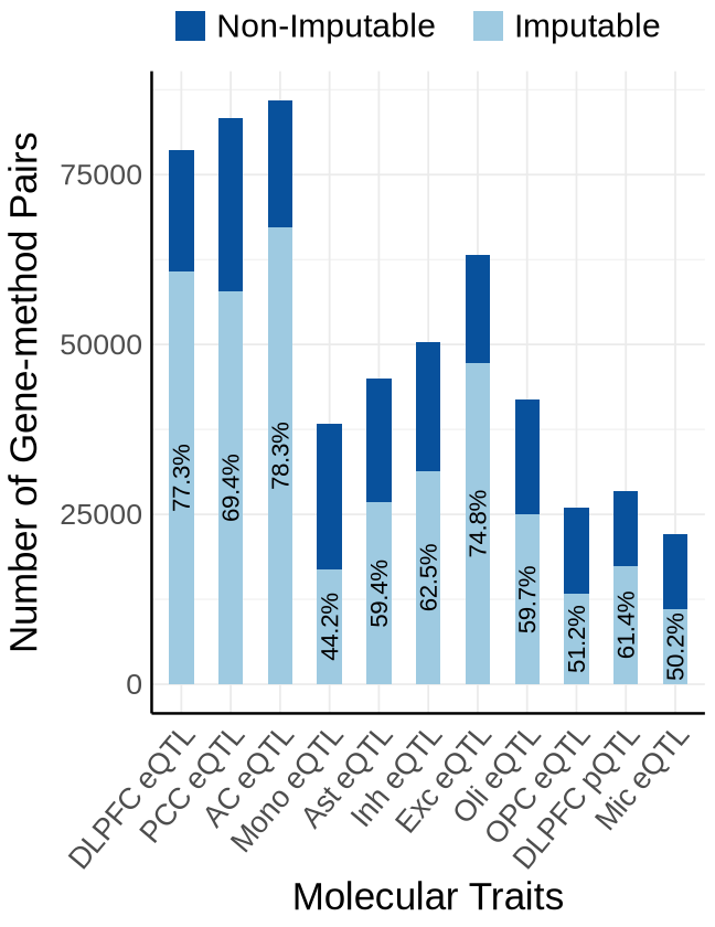
Fig1C#
custom_colors <- c("#E69F00",
            "#A6CEE3",
            "#009E73",
            "#B2DF8A",
            "#0072B2",
            "#FB9A99",
            "#DA70D6",
            "#999999")
names(custom_colors) <- c("mrash", "susie", "enet", "lasso",  "mrmash", "mvsusie", "bayes_r", "bayes_l")
proportion_by_context_method <- plot_data$fig_1C
options(repr.plot.width=10, repr.plot.height=7)
ggplot(proportion_by_context_method, aes(x = context_simp, y = proportion_imputable*100, fill = method)) +
  geom_bar(stat = "identity", position = position_dodge2(padding = 0.25, preserve = "single"),width = 0.79)+
  theme_minimal() +
  #theme_cowplot(12) +
  theme(
    axis.text.x = element_text(angle = 50, hjust = 1, size = 16),
    axis.text.y = element_text(size = 16),
    axis.title.x = element_text(size = 21,margin = margin(t = 5)),
    axis.title.y = element_text(size = 21),
    axis.line = element_line(size = 0.7, color = "black"),
    legend.position = "top",
    legend.justification = "right",
    legend.title = element_text(size = 18),
    legend.text = element_text(size = 16, margin = margin(b = 3,  unit = "pt")),#,
    legend.key.size = unit(8, "pt") #
  ) +
  scale_fill_manual(
      values = custom_colors,
      name = "Methods",
      labels = c(
      "enet"     = "Elastic-net",
      "lasso"    = "Lasso",
      "mrash"    = "mr.ash",
      "susie"    = "SuSiE",
      "mrmash"   = "mr.mash",
      "mvsusie"  = "mvSuSiE",
      "bayes_r"  = "BayesR",
      "bayes_l"  = "BayesL"
      )
    ) +
  labs(
    x = "Molecular Traits",
    y = "Proportion of Imputable Genes(%)",
    fill = "Method"
  )
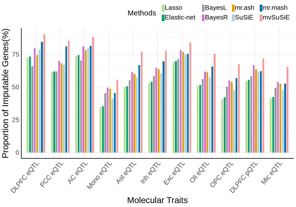
Fig1D#
library(patchwork)
plot_data_ctx <- plot_data$fig_1D
custom_colors <- c("#E69F00",  # orange
            "#A6CEE3", #light blue
            "#009E73",  # green
            "#B2DF8A",  # light green
            "#0072B2",  # dark blue
            "#FB9A99",
            "#DA70D6", #purple
            "#999999")  # gray
names(custom_colors) <- c("mrash", "susie", "enet", "lasso",  "mrmash", "mvsusie", "bayes_r", "bayes_l")
method_order <- c("lasso", "enet", "bayes_l", "bayes_r", "mrash", "susie", "mrmash", "mvsusie")
context_limits <- data.frame(
  context_simp = c("DLPFC_DeJager_eQTL","PCC_DeJager_eQTL",  "OPC_DeJager_eQTL", "Exc_DeJager_eQTL",
                   'AC_DeJager_eQTL', "Ast_DeJager_eQTL", "Mic_DeJager_eQTL",  "Oli_DeJager_eQTL", "Inh_DeJager_eQTL",
                  "DLPFC_Bennett_pQTL", "monocyte_ROSMAP_eQTL"),
  ymin = c(-0.02, -0.02, -0.005, -0.025, -0.025, -0.01, -0.005,  -0.01,-0.01,-0.015,-0.005),
  # ymax = c(0.35,   0.35, 0.15,   0.4,    0.4,   0.2,   0.15,   0.2,  0.2,  0.25,   0.15)
  ymax = c(0.25, 0.25, 0.08,  0.3, 0.3, 0.1, 0.8, 0.1,  0.1, 0.15, 0.08)
)
plots <- list()
for (i in 1:nrow(context_limits)) {
  ctx <- context_limits$context_simp[i]
  ymax <- context_limits$ymax[i]

  p <- ggplot(plot_data_ctx[[i]], aes(x = method, y = rsq_cv, fill = method)) +
    geom_violin(position = position_dodge(width = 0.85), trim = FALSE,
                color = "#a3a3a3", size = 0.2, width = 0.85, scale = "width") +
    geom_boxplot(width = 0.1, position = position_dodge(width = 0.85), outlier.shape = NA,
                 color = "#545252", size = 0.4) +
    theme_minimal() +
    #theme_cowplot(12) +
    theme(
      axis.text.x = element_text(angle = 35, hjust = 1, size = 16),
      axis.text.y = element_text(size = 16),
      axis.title.x = element_text(size = 21),
      axis.title.y = element_text(size = 21, margin = margin(r = 5)),
      plot.title =  element_blank(),
      strip.background = element_blank(),
      axis.line = element_line(size = 0.5, color = "black"),
      strip.text = element_text(size = 17, margin = margin(b = 23)),
      strip.placement = "outside",
      panel.spacing = unit(5, "lines")
    ) +
    scale_fill_manual(
      values = custom_colors,
      name = "Methods",
    ) +
    scale_x_discrete(labels = c(
      "enet"     = "Elastic-net",
      "lasso"    = "Lasso",
      "mrash"    = "mr.ash",
      "susie"    = "SuSiE",
      "mrmash"   = "mr.mash",
      "mvsusie"  = "mvSuSiE",
      "bayes_r"  = "BayesR",
      "bayes_l"  = "BayesL"
    ))+
    theme(legend.position = "none")+
    labs( y = expression("Cross Validation " ~ italic(r)^2), x="Method") +
    facet_wrap(~ context_simp, scales = "free", ncol = 2,
               labeller = labeller(context_simp = c(
                    Ast_DeJager_eQTL = "Ast eQTL\n(N=419, Cell Proportion=13%)",
                    Mic_DeJager_eQTL = "Mic Gene Expression \n(N=419, Cell Proportion=5%)",
                    monocyte_ROSMAP_eQTL = "Mono eQTL\n(N=226)",
                    AC_DeJager_eQTL = "AC eQTL \n(N=593)",
                    DLPFC_DeJager_eQTL= "DLPFC eQTL \n(N=784)",
                    DLPFC_Bennett_pQTL= "DLPFC Protein Expression \n(N=416)",
                    PCC_DeJager_eQTL="PCC eQTL\n(N=441)",
                    OPC_DeJager_eQTL="OPC Gene Expression \n (N=419, Cell Proportion=3%)",
                    Oli_DeJager_eQTL="Oli Gene Expression \n(N=419, Cell Proportion=20%)",
                    Inh_DeJager_eQTL="Inh Gene Expression \n(N=419)",
                    Exc_DeJager_eQTL="Exc eQTL\n(N=419, Cell Proportion=43%)"
     ))) +  # Create a panel for each context
    coord_cartesian(ylim = c(context_limits$ymin[i], ymax)) +
    #geom_hline(yintercept = 0.01, linetype = "dashed", color = "red") +
    ggtitle(ctx)

  plots[[i]] <- p
}
names(plots) <- c("DLPFC_DeJager_eQTL","PCC_DeJager_eQTL",  "OPC_DeJager_eQTL", "Exc_DeJager_eQTL",
                   'AC_DeJager_eQTL', "Ast_DeJager_eQTL", "Mic_DeJager_eQTL",  "Oli_DeJager_eQTL", "Inh_DeJager_eQTL",
                  "DLPFC_Bennett_pQTL", "monocyte_ROSMAP_eQTL")
options(repr.plot.width=19, repr.plot.height=5.5)
combined_plot <- wrap_plots(plots[c("DLPFC_DeJager_eQTL","PCC_DeJager_eQTL",'Ast_DeJager_eQTL', 'Exc_DeJager_eQTL')], nrow = 1)+
    plot_layout(guides = "collect") &
    theme(plot.margin = margin(r =20, t=0, l=0, b=0))
print(combined_plot)
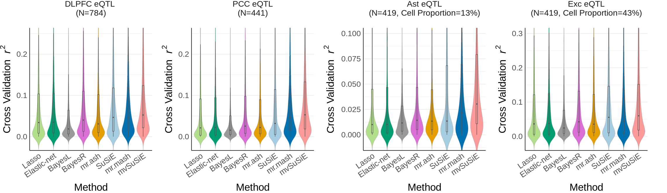
Fig 2 - RWAS Manhattan plot & Heatmap#
Fig2A - Manhattan plot#
fig2a <- plot_data$fig_2A$plot_data
chrom_lengths <- plot_data$fig_2A$chrom_lengths
axis_chr <- fig2a %>%
  group_by(chr) %>%
  summarise(center = (min(BPcum) + max(BPcum)) / 2)
region_colors <- c(
  "Chromosome Group1" = "#2166AC", # blue
  "Chromosome Group2" = "#e04e2d", # red
  "Chromosome Group3" = "#4DAF4A" # green
)
squish_trans <- function(from, to, factor) {
  trans <- function(x) {
    if (any(is.na(x))) return(x)
    # get indices for the relevant regions
    isq <- x > from & x < to
    ito <- x >= to
    # apply transformation
    x[isq] <- from + (x[isq] - from)/factor
    x[ito] <- from + (to - from)/factor + (x[ito] - to)
    return(x)
  }
  inv <- function(x) {
    if (any(is.na(x))) return(x)
    # get indices for the relevant regions
    isq <- x > from & x < from + (to - from)/factor
    ito <- x >= from + (to - from)/factor
    # apply transformation
    x[isq] <- from + (x[isq] - from) * factor
    x[ito] <- to + (x[ito] - (from + (to - from)/factor))
    return(x)
  }
  # return the transformation
  return(trans_new("squished", trans, inv))
}
options(repr.plot.width=14, repr.plot.height=8.5)
ggplot(fig2a, aes(x = BPcum, y = -log10(twas_pval), color = chr_group)) +
  geom_point(alpha = 0.7, size=1.5) +
  scale_color_manual(values = region_colors, drop = FALSE) +
  scale_x_continuous(labels = axis_chr$chr, breaks = axis_chr$center) +
  scale_y_continuous(expand = c(0, 0), trans = squish_trans(40, 68, 20),
                     breaks = c(0, 10, 20, 30, 40, 68, 70)
                    ) +
  geom_text_repel(
    data = subset(fig2a, -log10(twas_pval)> -log10(0.05 / 73874)), aes(label = gene_name),
    box.padding = 0.3, # space around each label
    point.padding = 0.3,
    force = 1, segment.size = 0.20,
    color = "black", max.overlaps=120, size = 2.7, show.legend = FALSE
  ) +
  geom_hline(yintercept = -log10(0.05 / 73874), linetype = "dashed", color = "red") +
  labs(
    x = "Chromosome",
    y = expression(-log[10](RWAS~italic(p-value)))
  ) +
  theme_bw() +
  theme_cowplot(12) +
  theme(
    panel.border = element_blank(),
    axis.line = element_line(),
    panel.grid.major = element_blank(),
    panel.grid.minor = element_blank(),
    plot.title = element_blank(),
    axis.title = element_text(size = 20),
    axis.text = element_text(size = 16),
    legend.position = "none"#,
    #plot.margin = margin(5, 5, 5, 28)
  )+
  #ylim(0,74)+
  coord_cartesian(ylim = c(0, 71), clip = "off")
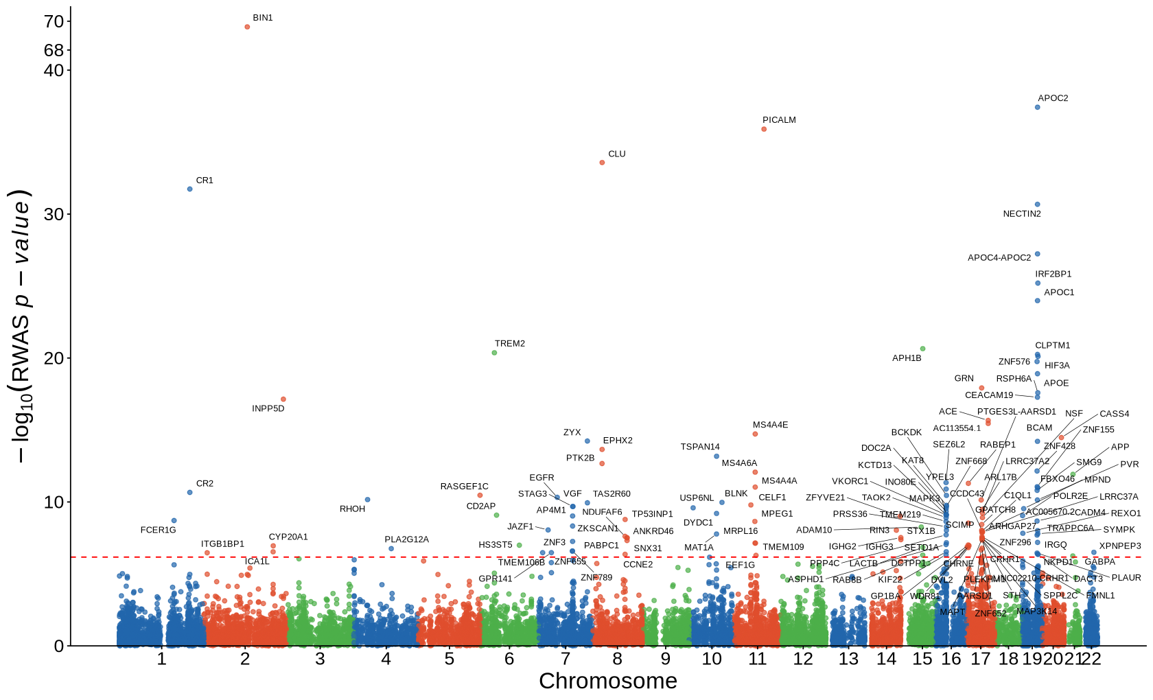
Fig2B - Heatmap#
library(ggpattern)
wide_df <- plot_data$fig_2B
tss_df <- plot_data$tss_df
plot_twasz_heatmap <- function(twasz_matrix, tss_df, na_pattern = "stripe",
                               context_top_first = TRUE, # put first context at top
                               chr1_left = TRUE,
                               low="#01738f",
                               mid = "white",
                               high = "#cc1002"
                              ){ # put chr1 at left # --- gene order by chromosomal position ---
    ann <- tss_df %>%
        rename(chr = '#chr') %>%
        mutate(
            chr_clean = str_to_upper(str_replace(chr, "^chr", "")),
            chr_idx = case_when(
                chr_clean %in% as.character(1:22) ~ as.integer(chr_clean),
                chr_clean == "X" ~ 23L,
                chr_clean == "Y" ~ 24L,
                chr_clean %in% c("M","MT") ~ 25L,
                TRUE ~ 99L
          )
    ) %>%
    filter(gene_name %in% rownames(twasz_matrix)) %>%
    arrange(chr_idx, start, gene_name)

    # genes on X axis: usually want chr1 on the LEFT -> no rev()
    gene_levels <- c(ann$gene_name, setdiff(rownames(twasz_matrix), ann$gene_name))
    if (!chr1_left) gene_levels <- rev(gene_levels) # contexts become rows (Y axis). By default, the first level appears at the BOTTOM,
    context_levels <- colnames(twasz_matrix)
    if (context_top_first) context_levels <- rev(context_levels)

    # --- long format ---
    df_long <- reshape2::melt(twasz_matrix)
    colnames(df_long) <- c("Gene", "Context", "twas_z")
    df_long <- df_long %>%
        mutate( Gene = factor(Gene, levels = gene_levels), Context = factor(Context, levels = context_levels) )
    # max_abs <- max(abs(df_long$twas_z), na.rm = TRUE)
    max_abs <- 11
    ggplot(df_long, aes(x = Gene, y = Context)) +
            geom_tile( data = dplyr::filter(df_long, !is.na(twas_z)), aes(fill = twas_z), color = "white" ) +
            scale_fill_gradient2( low = low, mid = mid, high = high, midpoint = 0,
                    limits = c(-max_abs, max_abs), oob = scales::squish,
                    name = "RWAS z-score") +
            # legend bar styling
            guides(fill = guide_colorbar( barwidth = unit(4.5, "cm"))) +
            # Pattern only for NA cells
            geom_tile_pattern( data = dplyr::filter(df_long, is.na(twas_z)), color = "white", fill = "grey97",
                    pattern = na_pattern, # "stripe", "circle", etc.
                    pattern_fill = "grey89", #
                    pattern_colour = "grey100",
                    pattern_angle = 45, pattern_density = 0.2,
                    pattern_spacing = 0.032,
                    pattern_size = 0.004, show.legend = FALSE ) +
            scale_x_discrete(position = "bottom") +
            theme_minimal() +
            theme( axis.text.x = element_text(hjust = 1, vjust = 0.5, angle=90, size = 8.2), #7.5
                   axis.text.y = element_text(size = 12), #9
                   legend.position = "top",
                   legend.title = element_text(size = 18, margin = margin(r = 17)),
                   legend.text = element_text(size = 16),#,
                   panel.grid = element_blank(),
                   axis.title = element_blank()
                 )
}
options(repr.plot.width=15, repr.plot.height=3.7)
plot_twasz_heatmap(wide_df, tss_df, low="#005870", high = "#cc1002")
Warning message:
“There was 1 warning in `mutate()`.
ℹ In argument: `chr_idx = case_when(...)`.
Caused by warning:
! NAs introduced by coercion”
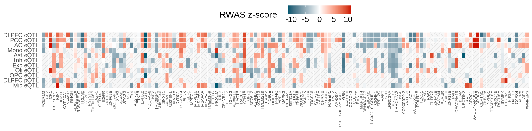
Fig 3 - GO enrichment#
go <- plot_data$fig3
go <- go %>%
  dplyr::filter(source %in% c("GO:BP","GO:CC","GO:MF")) %>%
  mutate(
    Ontology  = factor(sub("^GO:", "", source), levels = c("BP","CC","MF")),
    GeneRatio = intersection_size / query_size,
    Count     = intersection_size,
    negLogP   = -log10(p_value)
  )

top_n <- 12
go_top <- go %>%
  group_by(Ontology) %>%
  arrange(p_value, desc(GeneRatio)) %>%
  slice_head(n = top_n) %>%
  ungroup() %>%
  group_by(Ontology) %>%
  mutate(term_name = factor(term_name, levels = rev(unique(term_name[order(GeneRatio)])))) %>%
  ungroup()

xmax <- max(go_top$GeneRatio, na.rm = TRUE)
x_upper  <- xmax + 0.15 * xmax
options(repr.plot.width=9.2, repr.plot.height=6)
ggplot(go_top, aes(x = GeneRatio, y = term_name)) +
  # lollipop stick now shares the same color mapping as the bubble
  geom_segment(aes(x = 0, xend = GeneRatio, y = term_name, yend = term_name, color = negLogP),
               linewidth = 0.6) +
  geom_point(aes(size = Count, color = negLogP)) +
  facet_grid(Ontology ~ ., scales = "free_y", space = "free_y") +
  scale_size_area(max_size = 7.5, name = "Overlap genes") +
  scale_color_gradient(low = "dodgerblue", high = "red", name = "-log10(adj.pval)") +
  scale_x_continuous(limits = c(0, x_upper), expand = expansion(mult = c(0, 0.02))) +
  labs(
    x = "Gene Ratio",
    y = NULL#,
    #title = "GO Enrichment of RWAS-significant Genes"
  ) +
  theme_bw(base_size = 12) +
  theme(
    strip.text.y = element_text(face = "bold", size = 11),
    strip.background = element_blank(),
    axis.text.y = element_text(size = 10),
    panel.grid.minor = element_blank(),
    legend.position = "right"
  )
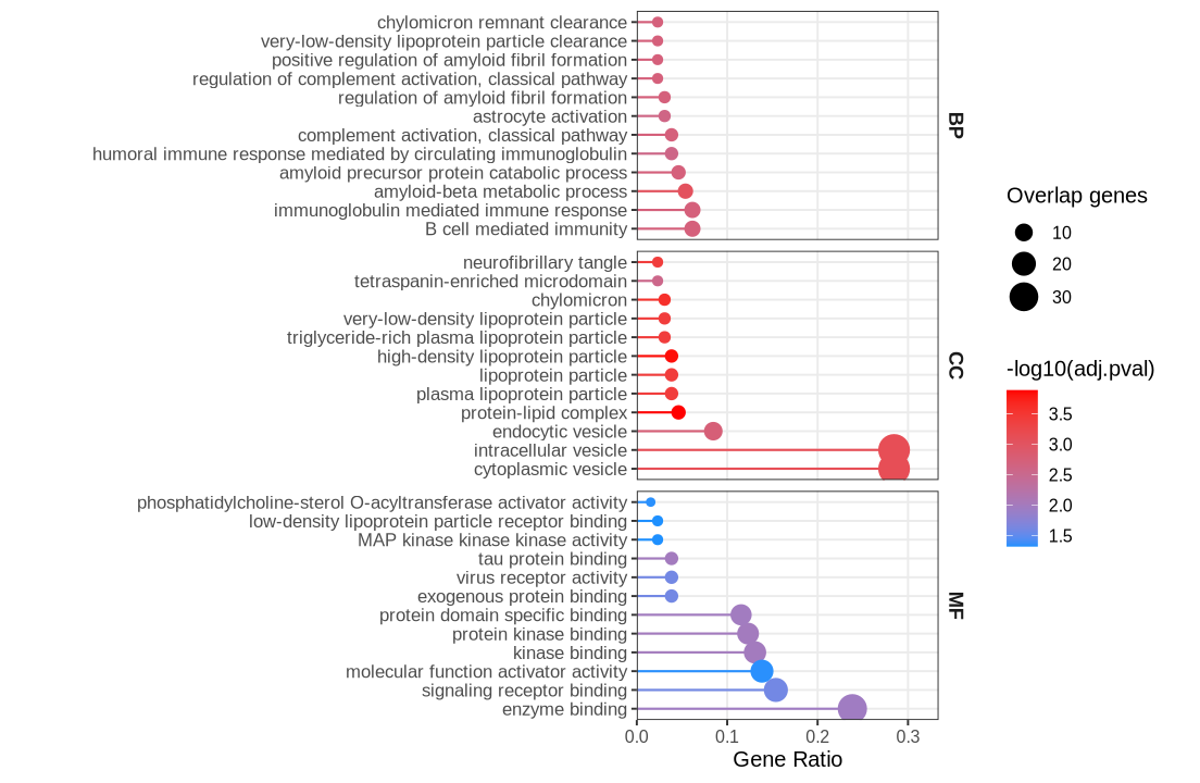
Fig 4 - RWAS results distribution#
Fig 4A#
context_counts <- plot_data$fig_4A
options(repr.plot.width=5.6, repr.plot.height=7)
ggplot(context_counts, aes(x = context, y = proportion*100)) +
  geom_bar(stat = "identity", width=0.4, fill="#08519c") +
  theme_minimal() +
  theme_cowplot(12) +
  theme(axis.text.x = element_text(angle = 45, hjust = 1, size = 15),
        axis.text.y = element_text(size = 15),
        axis.title.x = element_text(size = 21),
        axis.title.y = element_text(size = 21),
        axis.line = element_line(size = 0.6, color = "black")  # Thicker black axis lines
  )+
  labs(
    x = "Molecular Traits",
    y = "Proportion of Associations (%)"
  )
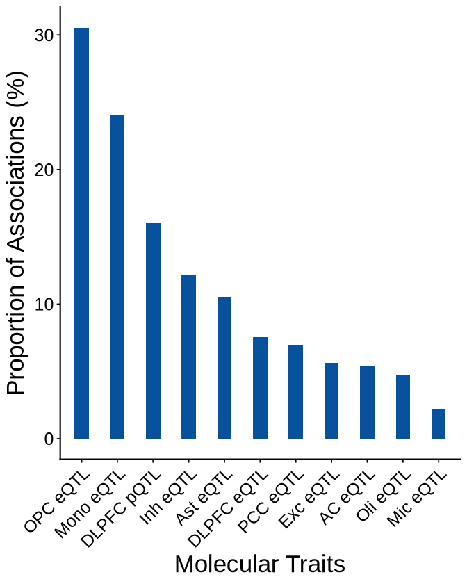
Fig4B#
fig4b <- plot_data$fig_4B
custom_colors <- c("#E69F00",  # orange
            "#A6CEE3", #light blue
            "#009E73",  # green
            "#B2DF8A",  # light green
            "#0072B2",  # dark blue
            "#FB9A99",
            "#DA70D6", #purple
            "#999999")  # gray
names(custom_colors) <- c("mrash", "susie", "enet", "lasso",  "mrmash", "mvsusie", "bayes_r", "bayes_l")
options(repr.plot.width=9, repr.plot.height=7)
ggplot(fig4b, aes(x = context_simp, y = -log10(twas_pval), fill = method)) +
  geom_bar(stat = "identity", position = position_dodge2(width = 0.75, preserve = "single", padding = 0.15), width = 0.8, alpha=1) +
  theme_minimal() +
  theme_cowplot(12) +
  theme(
    axis.text.x = element_text(angle = 45, hjust = 1, size = 15),
    axis.text.y = element_text(size = 15),
    axis.title.x = element_text(size = 21, margin = margin(t = 15, unit = "pt")),
    axis.title.y = element_text(size = 21),#margin = margin(r = 5)
    axis.line = element_line(size =0.6, color = "black"),  # Thicker black axis lines
    text = element_text(size = 14),
    legend.title = element_text(size = 18),
    legend.text = element_text(size = 15, margin = margin(b = 1, l=4, unit = "pt")),#,
    legend.position = "top",
    legend.justification = "center",
    legend.box.spacing = unit(1, "pt")
  ) +
  scale_fill_manual(
    values = custom_colors,
    # labels = c("Elastic net", "Lasso", expression(italic("mr.ash")),
    #            expression(italic("mr.mash")), "mvSuSiE", "SuSiE"),
    name = "Methods",
    labels = c(
      "enet"     = "Elastic-net",
      "lasso"    = "Lasso",
      "mrash"    = "mr.ash",
      "susie"    = "SuSiE",
      "mrmash"   = "mr.mash",
      "mvsusie"  = "mvSuSiE",
      "bayes_r"  = "BayesR",
      "bayes_l"  = "BayesL"
      ),
      guide = guide_legend(override.aes = list(size = 2))
  ) + # Color the bars by method
  labs(
    x = "Molecular Traits",
    y = expression(-log[10](RWAS~italic(p-value))),
  ) +
  geom_hline(yintercept = -log10(0.05 / 73874), linetype = "dashed", color = "red") +
  guides(fill = guide_legend(byrow = TRUE))
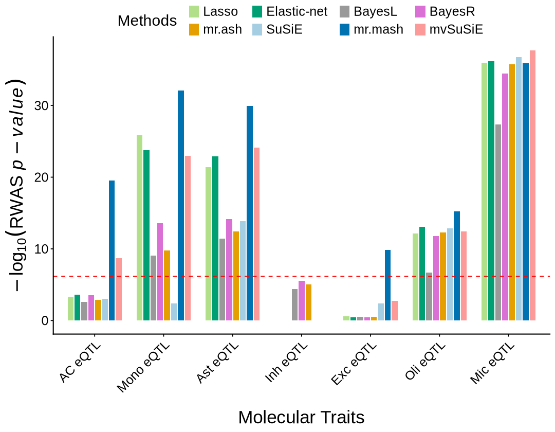
fig 4C#
prop_sig_context <- plot_data$fig_4C
options(repr.plot.width=6.4, repr.plot.height=7)
ggplot(prop_sig_context, aes(x = context_simp)) +
  geom_col(aes(y = total_imputable), fill = "#08519c", width=0.4) +
  geom_point(aes(y = proportion_significant * 900000), color = "#9ecae1", size = 4.5) +
  theme_minimal() +
  theme_cowplot(12) +
  theme(axis.text.x = element_text(angle = 45, hjust = 1, size = 15),
        axis.text.y = element_text(size = 15),
        axis.title.x = element_text(size = 20),
        axis.title.y.left = element_text(size = 20),
        axis.title.y.right = element_text(size = 18)  # margin to left
        #axis.line = element_line(size = 0.8, color = "black")
        )+ # Thicker black axis lines)+
  scale_y_continuous(
    name = "Number of Imputable Genes",
    sec.axis = sec_axis(~ . / 9000, name = "Significant RWAS Association Proportion(%)")
  ) +
 labs(x = "Molecular Traits")
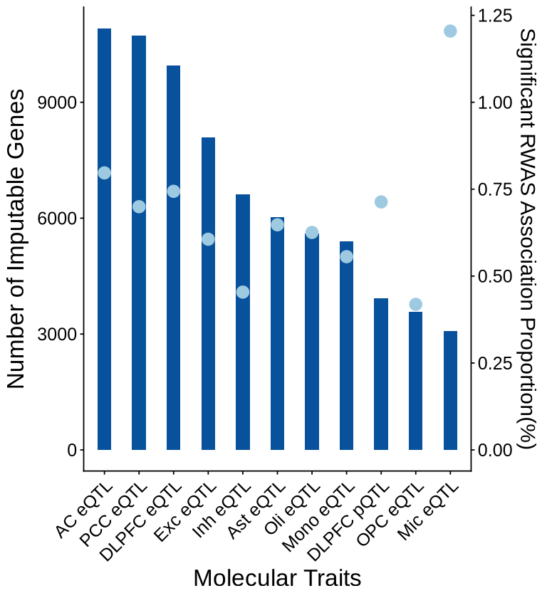
Fig 5 - RWAS Z scores filtered by M-cTWAS evidence#
options(repr.plot.width = 17, repr.plot.height = 9.5)
context_colors <- c(
  'DLPFC_Bennett_pQTL'     = "#17becf",  # teal
  'DLPFC_DeJager_eQTL'     = "#1f77b4",  # blue
  'PCC_DeJager_eQTL'       = "#ff7f0e",  # orange
  'AC_DeJager_eQTL'        = "#15995e",  # green
  'monocyte_ROSMAP_eQTL'   = "#d62728",  # red
  'Ast_DeJager_eQTL'       = "#b3c940",
  'Inh_DeJager_eQTL'       = "#8c564b",  # brown
  'Exc_DeJager_eQTL'       = "#e377c2",  # pink
  'Oli_DeJager_eQTL'       = "#fcbcb3",  # light pink
  'OPC_DeJager_eQTL'       = "#b281f7",  # purple
  'Mic_DeJager_eQTL'       = "gold3"     # magenta
)
names(context_colors) <- gsub("_DeJager_|_ROSMAP_|_Bennett_", " ", names(context_colors))
names(context_colors) <- gsub("monocyte", "Mono",names(context_colors))
base_df_nonsig <- plot_data$fig5$base_df_nonsig
base_df_sig <- plot_data$fig5$base_df_sig
pie_df_sig <- plot_data$fig5$pie_df_sig
pie_df_nonsig <- plot_data$fig5$pie_df_nonsig
pie_cols <- plot_data$fig5$pie_cols
label_df <- plot_data$fig5$label_df
axis_chr <- plot_data$fig5$axis_chr
thr <- -log10(0.05 / 73874)
ggplot() +
  ## base grey (RWAS non-significant)
  geom_point(
    data = subset(base_df_nonsig, -log10(twas_pval) < thr),
    aes(x = BPplot, y = twas_z, size = susie_pip, color = context_legend),
     alpha = 0.7
  ) +
  ## base colored (RWAS significant)
  geom_point(
    data = subset(base_df_sig, -log10(twas_pval) >= thr),
    aes(x = BPplot, y = twas_z, color = context_legend, size = susie_pip),
    alpha = 1
  ) +

  ## pie clusters: NON-significant -> grey circle only (no colored slices)
  geom_point(
    data = pie_df_nonsig,
    aes(x = BPplot, y = twas_z),
    shape = 21, fill = "grey80", color ="grey80",
    # crude mapping from r to a visible point size; tweak multiplier if needed
    size = pie_df_nonsig$r * 26.5,
    inherit.aes = FALSE
  ) +

  ## pie clusters: significant -> colored pies
  scatterpie::geom_scatterpie(
    data = pie_df_sig,
    aes(x = BPplot, y = twas_z, r = r),
    cols = pie_cols,
    show.legend = FALSE,
    color = NA, alpha = 1
  ) +

  scale_size_continuous(name = "cTWAS PIP", range = c(2.5, 5.5), limits = c(0, 1)) +
  scale_color_manual(
    values = c(context_colors, "Non-RWAS-significant" = "grey75"),
    breaks = c(names(context_colors), "Non-RWAS-significant"),
    limits = c(names(context_colors), "Non-RWAS-significant"),
    drop = FALSE,
    name = "Molecular Traits"
  ) +
  scale_fill_manual(
    values = context_colors,
    breaks = names(context_colors),
    limits = names(context_colors),
    drop = FALSE,
    name = "Molecular Traits"
  ) +
  scale_x_continuous(labels = axis_chr$chr, breaks = axis_chr$centerPlot) +

  geom_text_repel(
    data = label_df,
    aes(x = BPplot, y = twas_z, label = gene_name),
    color = "black",
    box.padding = 0.35,
    point.padding = 0.1,
    segment.size = 0.22,
    max.overlaps = Inf,
    size = 3.5,
    show.legend = FALSE
  )+

  geom_hline(yintercept = 0) +
  labs(x = "Chromosome", y = "RWAS Z-score") +
  theme_bw() +
  theme_cowplot(12) +
  theme(
    panel.border = element_blank(),
    axis.line = element_line(),
    axis.line.x = element_blank(),
    panel.grid.major = element_blank(),
    panel.grid.minor = element_blank(),
    plot.title = element_blank(),
    axis.title = element_text(size = 20),
    axis.text  = element_text(size = 14),
    legend.title = element_text(size = 14),
    legend.text  = element_text(size = 12)
  ) +
  guides(
    color = guide_legend(override.aes = list(size = 3), order = 1),
    fill  = guide_legend(override.aes = list(size = 4), order = 1),
    size  = guide_legend(order = 2)
  )
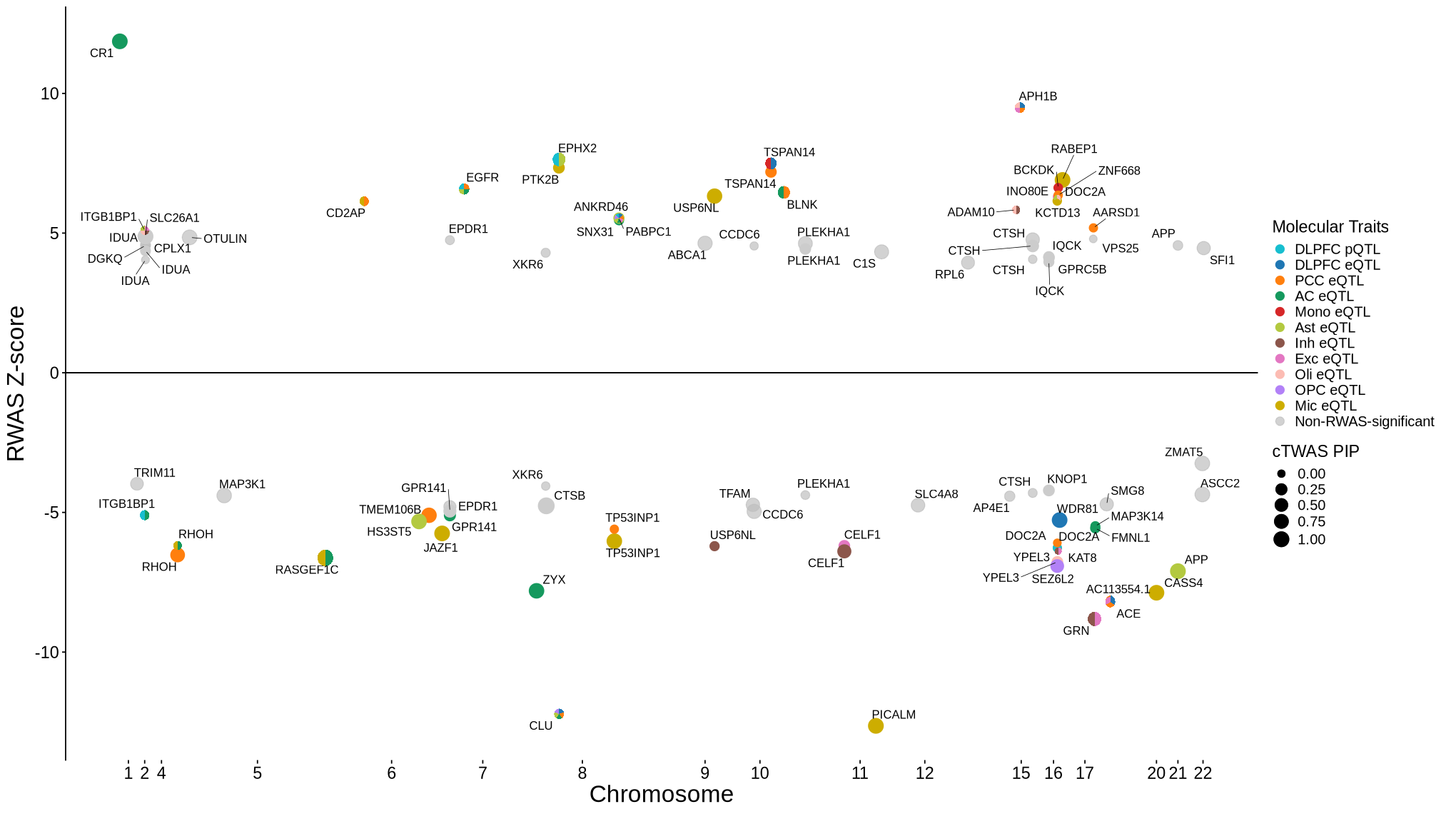
Fig 6 - cTWAS locus plot#
library(EnsDb.Hsapiens.v86)
ens_db <- EnsDb.Hsapiens.v86
library(stringr)
library(data.table)
library('logging')
library('locuszoomr')
library('ggnewscale')
source("ctwas_plots_LDcs.R")
Fig 6A - TREM2#
cor_res <- readRDS("rosmap_eqtl_pqtl_allGWAS.region_cor.chr6_40377803_42070711.Bellenguez_2022.rds")
options(repr.plot.width=7, repr.plot.height=6.2)
rs <- plot_data$fig_6A
make_locusplot(rs,
                 region_id = "6_40377803_42070711",
                 ens_db = ens_db,
                 #weights = weights,
                 highlight_pval= 0.05/73874,
                 highlight_pip = 0.8,
                 locus_range=c(40822803,41480711),
                 filter_protein_coding_genes = TRUE,
                 filter_cs = FALSE,
                 label.text.size = 0,
                 max.overlaps = 25,
                 axis.text.size = 11,
                 axis.title.size = 13,
                 legend.text.size = 13,
                 color_pval_by = "LD",
                 color_pip_by = "LD",
                 R_snp_gene = cor_res$R_snp_gene,
                 R_gene = cor_res$R_gene,
                 LD.breaks = c(0, 0.4, 0.8, 1),
                 LD.colors = c("#08519c", "#7fc97f", "#fdb462", "#e41a1c"),
                 cs.colors = c( "#995cfa", "blue", "forestgreen", "darkmagenta", "darkorange", "grey"),
                 point.alpha = c(0.7, 0.85, 0.35),
                 point.sizes = c(1.5, 3.5),
                 legend.position = "top",
                 #nudge_y=2,
                 #box.padding=0.15,
                 genelabel.cex.text = 0.63,
                 panel.heights = c(4, 4, 0, 2)
               )
2026-05-14 15:15:12.795886 INFO::'gene_type' column cannot be found in finemap_res. Skipped filtering protein coding genes.
2026-05-14 15:15:12.802484 INFO::focal id: ENSG00000095970|eQTL_DLPFC_DeJager_eQTL
2026-05-14 15:15:12.808315 INFO::focal molecular trait: TREM2 DLPFC eQTL eQTL
2026-05-14 15:15:12.809592 INFO::Range of locus: chr6:40822803-41480711
chromosome 6, position 40822803 to 41480711

3690 SNPs/datapoints
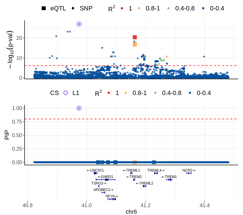
Fig 6B - PICALM#
options(repr.plot.width=7, repr.plot.height=6.3)
cor_res <- readRDS("rosmap_eqtl_pqtl_allGWAS.region_cor.chr11_84267999_86714492.Bellenguez_2022.rds")
rs <- plot_data$fig_6B
make_locusplot(rs,
                 region_id = "11_84267999_86714492",
                 ens_db = ens_db,
                 #annotate_cs_on_ld=TRUE,
                 highlight_pval= 0.05/73874,
                 highlight_pip = 0.8,
                 locus_range=c(85870999,86300492),
                 filter_protein_coding_genes = TRUE,
                 filter_cs = FALSE,
                 label.text.size = 3.5,
                 max.overlaps = 0,
                 axis.text.size = 11,
                 axis.title.size = 13,
                 legend.text.size = 13,
                 color_pval_by = "LD",
                 color_pip_by = "LD",
                 R_snp_gene = cor_res$R_snp_gene,
                 R_gene = cor_res$R_gene,
                 LD.breaks = c(0, 0.4, 0.8, 1),
                 LD.colors = c("#08519c", "#7fc97f", "#fdb462", "#e41a1c"),
                 cs.colors = c( "#995cfa", "blue", "forestgreen", "darkmagenta", "darkorange", "grey"),
                 # legend.title.size =22,
                 # point.alpha = c(0.7, 0.85, 0.35),
                 #point.sizes = c(1.5, 3.5),
                 legend.position = "top",
                 #nudge_y=4.5,
                 #box.padding=0.1,
                 #label_all_genes=FALSE,
                 genelabel.cex.text = 0.63,
                 panel.heights = c(4, 4,0, 2),
                 #merge_context_labels = FALSE
               )
2026-05-14 12:49:36.071258 INFO::'gene_type' column cannot be found in finemap_res. Skipped filtering protein coding genes.
2026-05-14 12:49:36.076864 INFO::focal id: ENSG00000073921|eQTL_Mic_DeJager_eQTL
2026-05-14 12:49:36.082272 INFO::focal molecular trait: PICALM Mic eQTL eQTL
2026-05-14 12:49:36.083418 INFO::Range of locus: chr11:85870999-86300492
chromosome 11, position 85870999 to 86300492

2064 SNPs/datapoints

Warning message:
"ggrepel: 12 unlabeled data points (too many overlaps). Consider increasing max.overlaps"
Warning message:
"ggrepel: 12 unlabeled data points (too many overlaps). Consider increasing max.overlaps"
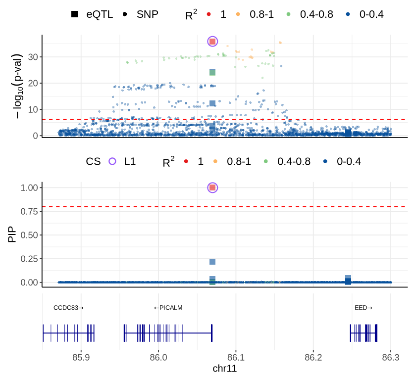
Fig 6C - RABEP1#
cor_res <- readRDS("rosmap_eqtl_pqtl_allGWAS.region_cor.chr17_4611485_5782462.Bellenguez_2022.rds")
rs <- plot_data$fig_6C
make_locusplot (rs,
                 region_id = "17_4611485_5782462",
                 ens_db = ens_db,
                 #weights = weights,
                 highlight_pval= 0.05/73874,
                 highlight_pip = 0.8,
                 locus_range=c(4927485,5346462),
                 filter_protein_coding_genes = TRUE,
                 filter_cs = FALSE,
                 label.text.size = 0,
                 max.overlaps = 0,
                 axis.text.size = 11,
                 axis.title.size = 13,
                 legend.text.size = 13,
                 color_pval_by = "LD",
                 color_pip_by = "LD",
                 R_snp_gene = cor_res$R_snp_gene,
                 R_gene = cor_res$R_gene,
                 LD.breaks = c(0, 0.4, 0.8, 1),
                 LD.colors = c("#08519c", "#7fc97f", "#fdb462", "#e41a1c"),
                 cs.colors = c( "#995cfa", "blue", "forestgreen", "darkmagenta", "darkorange", "grey"),
                 #point.alpha = c(0.7, 0.85, 0.35),
                 point.sizes = c(1.5, 3.5),
                 legend.position = "top",
                 #nudge_y=2,
                 #box.padding=0.15,
                 genelabel.cex.text = 0.62,
                 panel.heights = c(4, 4, 0, 2.8)
               )
2026-05-14 12:56:19.07996 INFO::'gene_type' column cannot be found in finemap_res. Skipped filtering protein coding genes.
2026-05-14 12:56:19.080679 INFO::focal id: ENSG00000029725|eQTL_Mic_DeJager_eQTL
2026-05-14 12:56:19.081181 INFO::focal molecular trait: RABEP1 Mic eQTL eQTL
2026-05-14 12:56:19.081878 INFO::Range of locus: chr17:4927485-5346462
chromosome 17, position 4927485 to 5346462

1797 SNPs/datapoints

Warning message:
"ggrepel: 51 unlabeled data points (too many overlaps). Consider increasing max.overlaps"
Warning message:
"ggrepel: 51 unlabeled data points (too many overlaps). Consider increasing max.overlaps"
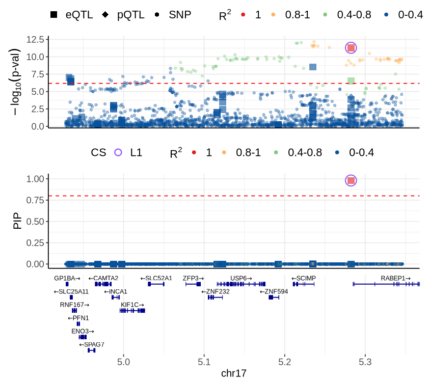
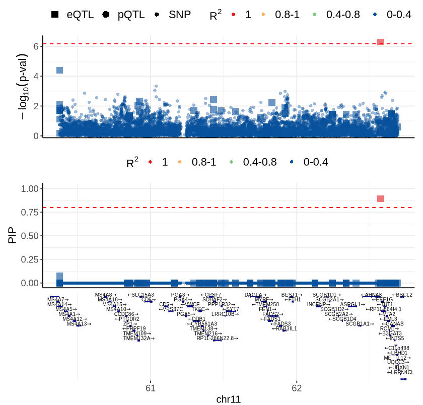
Fig 6D - EEF1G#
cor_res <- readRDS("rosmap_eqtl_pqtl_allGWAS.region_cor.chr11_60339997_63818332.Bellenguez_2022.rds")
rs <- plot_data$fig_6D
options(repr.plot.width=7, repr.plot.height=6.7)
source("ctwas_plots_LDonly.R")
make_locusplot (rs,
                 region_id = "11_60339997_63818332",
                 ens_db = ens_db,
                 #weights = weights,
                 highlight_pval= 0.05/73874,
                 highlight_pip = 0.8,
                 locus_range=c(60378097,62690332),
                 filter_protein_coding_genes = TRUE,
                 filter_cs = FALSE,
                 label.text.size = 0,
                 max.overlaps = 0,
                 axis.text.size = 11,
                 axis.title.size = 13,
                 legend.text.size = 13,
                 color_pval_by = "LD",
                 color_pip_by = "LD",
                 R_snp_gene = cor_res$R_snp_gene,
                 R_gene = cor_res$R_gene,
                 LD.breaks = c(0, 0.4, 0.8, 1),
                 LD.colors = c("#08519c", "#7fc97f", "#fdb462", "#e41a1c"),
                 #cs.colors = c( "#995cfa", "blue", "forestgreen", "darkmagenta", "darkorange", "grey"),
                 point.sizes = c(1.5, 3.5),
                 legend.position = "top",
                 #nudge_y=2,
                 #box.padding=0.15,
                 genelabel.cex.text = 0.5,
                 panel.heights = c(4, 4, 0, 2.8)
               )
2026-05-14 15:18:47.508862 INFO::'gene_type' column cannot be found in finemap_res. Skipped filtering protein coding genes.
2026-05-14 15:18:47.509756 INFO::focal id: ENSG00000254772|eQTL_Ast_DeJager_eQTL
2026-05-14 15:18:47.510373 INFO::focal molecular trait: EEF1G Ast eQTL eQTL
2026-05-14 15:18:47.51186 INFO::Range of locus: chr11:60378097-62690332
chromosome 11, position 60378097 to 62690332

9400 SNPs/datapoints

Warning message:
"ggrepel: 172 unlabeled data points (too many overlaps). Consider increasing max.overlaps"
Warning message:
"ggrepel: 172 unlabeled data points (too many overlaps). Consider increasing max.overlaps"
Supplementary FigS1 : MSBB#
Fig S1-A - MSBB#
context_order <- c('FP eQTL','STG eQTL', 'PHG eQTL', 'IFG eQTL','PHG pQTL')
proportion_by_context_msbb <- plot_data$supp_fig_1A$proportion_by_context_msbb
plot_data_long <- plot_data$supp_fig_1A$plot_data_long
options(repr.plot.width=5.7, repr.plot.height=6.5)
ggplot(plot_data_long, aes(x = Contexts, y = count, fill = type)) +
  geom_bar(stat = "identity", width=0.31) +
    geom_text(
      data = proportion_by_context_msbb,
      aes(x = context_simp,
          y = imputable_count / 2,
          label = paste0(round(proportion_imputable * 100, 1), "%")),
      inherit.aes = FALSE,
      size = 5.5, angle=90,
      color = "black"
    )+
  theme_minimal() +
  #theme_cowplot(12) +
  theme(axis.text.x = element_text(angle = 50, hjust = 1, size = 15),
        axis.text.y = element_text(size = 15),
        axis.title.x = element_text(size = 21, margin = margin(t = 9)),
        axis.title.y = element_text(size = 21),
        axis.line = element_line(size = 0.7, color = "black"),# Thicker black axis lines
        legend.title = element_blank(),
        legend.justification = "center",
        legend.margin = margin(b=10),
        legend.text = element_text(size = 18),
        legend.position="top",
        strip.background = element_blank()
        )+
    # scale_fill_brewer(palette = "PuOr", name = "Category",
    #               labels = c("imputable_count" = "Imputable", "non_imputable_count" = "Non-Imputable"))+
    scale_fill_manual(
      values = c("imputable_count" = "#9ecae1", "non_imputable_count" = "#08519c"),
      labels = c("imputable_count" = "Imputable","non_imputable_count" = "Non-Imputable"),
      name = "Category"
    )+
    labs(y = "Number of Genes", x="Molecular Traits", fill = "Category")
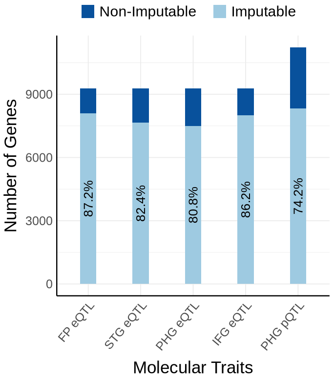
Fig S1-B - MSBB#
proportion_by_context <- plot_data$supp_fig_1B$proportion_by_context
plot_data_long  <- plot_data$supp_fig_1B$plot_data_long
options(repr.plot.width=5.7, repr.plot.height=6.5)
ggplot(plot_data_long, aes(x = Contexts, y = count, fill = type)) +
  geom_bar(stat = "identity", width=0.31) +
  geom_text(
      data = proportion_by_context,
      aes(x = context_simp,
          y = imputable_count / 2,
          label = paste0(round(proportion_imputable * 100, 1), "%")),
      inherit.aes = FALSE,
      size = 5.5, angle=90
    )+
  theme_minimal() +
  #theme_cowplot(12) +
  theme(axis.text.x = element_text(angle = 50, hjust = 1, size = 15),
        axis.text.y = element_text(size = 15),
        axis.title.x = element_text(size = 21, margin = margin(t = 9)),
        axis.title.y = element_text(size = 21), #margin = margin(r = 1)
        axis.line = element_line(size = 0.7, color = "black"),# Thicker black axis lines
        #legend.title = element_text(size = 17),
        legend.title = element_blank(),
        legend.justification = "center",
        legend.margin = margin(b=10),
        legend.text = element_text(size = 18),
        legend.position="top",
        strip.background = element_blank()
        )+
    # scale_fill_brewer(palette = "PuOr", name = "Category",
    #               labels = c("imputable_count" = "Imputable", "non_imputable_count" = "Non-Imputable"))+
    scale_fill_manual(
      values = c("imputable_count" = "#9ecae1", "non_imputable_count" = "#08519c"),
      labels = c("imputable_count" = "Imputable", "non_imputable_count" = "Non-Imputable"),
      name = "Category"
    )+
    labs(y = "Number of Gene-method Pairs", x="Molecular Traits", fill = "Category")
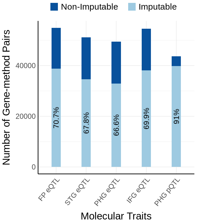
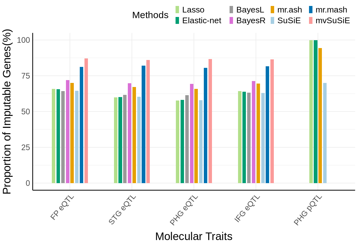
Fig S1C - MSBB#
custom_colors <- c("#E69F00",  # orange
            "#A6CEE3", #light blue
            "#009E73",  # green
            "#B2DF8A",  # light green
            "#0072B2",  # dark blue
            "#FB9A99",
            "#DA70D6", #purple
            "#999999")  # gray
names(custom_colors) <- c("mrash", "susie", "enet", "lasso",  "mrmash", "mvsusie", "bayes_r", "bayes_l")
proportion_by_context_method <- plot_data$supp_fig_1C
# Clustered bar plot
options(repr.plot.width=9.5, repr.plot.height=6.5)
ggplot(proportion_by_context_method, aes(x = context_simp, y = proportion_imputable*100, fill = method)) +
  geom_bar(stat = "identity", position = position_dodge2(padding = 0.25, preserve = "single"),width = 0.6)+
  theme_minimal() +
  #theme_cowplot(12) +
  theme(
    axis.text.x = element_text(angle = 50, hjust = 1, size = 15),
    axis.text.y = element_text(size = 15),
    axis.title.x = element_text(size = 21,margin = margin(t = 9)),
    axis.title.y = element_text(size = 21, margin = margin(r = 5)),
    axis.line = element_line(size = 0.7, color = "black"),
    legend.position = "top",
    legend.justification = "right",
    legend.title = element_text(size = 18),
    legend.text = element_text(size = 16),#,
    # legend.spacing.y = unit(8, "pt"),  # increase vertical space between items
    # legend.box.spacing = unit(6, "pt"),
    legend.key.size = unit(8, "pt") #
  ) +
  scale_fill_manual(
      values = custom_colors,
      name = "Methods",
      labels = c(
      "enet"     = "Elastic-net",
      "lasso"    = "Lasso",
      "mrash"    = "mr.ash",
      "susie"    = "SuSiE",
      "mrmash"   = "mr.mash",
      "mvsusie"  = "mvSuSiE",
      "bayes_r"  = "BayesR",
      "bayes_l"  = "BayesL"
      )
    ) +
  labs(
    x = "Molecular Traits",
    y = "Proportion of Imputable Genes(%)",
    fill = "Method"
  )
Warning message:
“The `size` argument of `element_line()` is deprecated as of ggplot2 3.4.0.
ℹ Please use the `linewidth` argument instead.”
Supplementary FigS2 : KNIGHT#
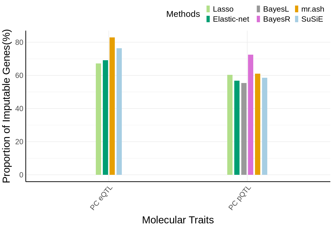
Fig S2-A - KNIGHT#
proportion_by_context <- plot_data$supp_fig_2A$proportion_by_context
plot_data_long <- plot_data$supp_fig_2A$plot_data_long
context_order <- c('PC eQTL', 'PC pQTL')
label_df <- proportion_by_context %>%
  mutate(
    Contexts = factor(context_simp, levels = context_order),
    total = unique_count,
    label = paste0(round(proportion_imputable * 100, 1), "%"),
    # place label just ABOVE the orange (imputable) part
    y_lab = imputable_count + pmax(50, 0.02 * unique_count)  # small nudge + proportional nudge
  ) %>%
  dplyr::select(Contexts, y_lab, label, total)
# --- y-axis buffers (tune these once, then forget) ---
y_max <- max(label_df$total, na.rm = TRUE)
y_top <- y_max * 1.05        # 10% headroom on top
options(repr.plot.width=5.7, repr.plot.height=6.5)

y_bottom <- -0.04 * y_max    # 5% negative space below zero (e.g., -5k if max=100k)

ggplot(plot_data_long, aes(x = Contexts, y = count, fill = type)) +
  geom_bar(stat = "identity", width=0.15) +
    geom_text(
      data = proportion_by_context,
      aes(x = context_simp,
          y = imputable_count / 2,
          label = paste0(round(proportion_imputable * 100, 1), "%")),
      inherit.aes = FALSE,
      size = 5.5, angle=90,
      color = "black"
    )+
  coord_cartesian(ylim = c(y_bottom, y_top), clip = "off") +
  theme_minimal() +
  #theme_cowplot(12) +
  theme(axis.text.x = element_text(angle = 50, hjust = 1, size = 15),
        axis.text.y = element_text(size = 15),
        axis.title.x = element_text(size = 21, margin = margin(t = 9)),
        axis.title.y = element_text(size = 21),
        axis.line = element_line(size = 0.7, color = "black"),# Thicker black axis lines
        legend.title = element_blank(),
        legend.justification = "center",
        legend.margin = margin(b=10),
        legend.text = element_text(size = 18),
        legend.position="top",
        strip.background = element_blank()
        )+
    # scale_fill_brewer(palette = "PuOr", name = "Category",
    #               labels = c("imputable_count" = "Imputable", "non_imputable_count" = "Non-Imputable"))+
    scale_fill_manual(
      values = c("imputable_count" = "#9ecae1", "non_imputable_count" = "#08519c"),
      labels = c("imputable_count" = "Imputable","non_imputable_count" = "Non-Imputable"),
      name = "Category"
    )+
    labs(y = "Number of Genes", x="Molecular Traits", fill = "Category")
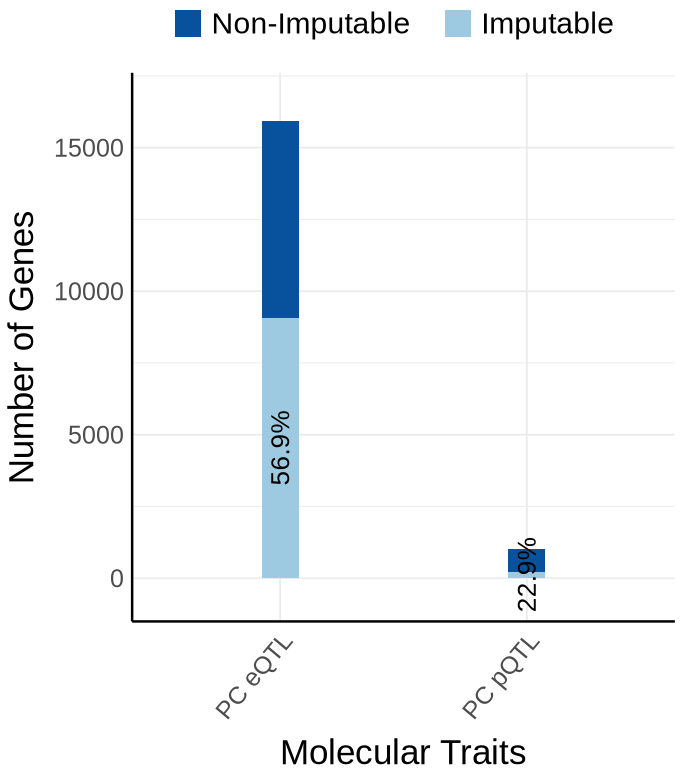
Fig S2-B - KNIGHT#
proportion_by_context <- plot_data$supp_fig_2B$proportion_by_context
plot_data_long <- plot_data$supp_fig_2B$plot_data_long
label_df <- proportion_by_context %>%
  mutate(
    Contexts = factor(context_simp, levels = context_order),
    total = total_count,
    label = paste0(round(proportion_imputable * 100, 1), "%"),
    # place label just ABOVE the orange (imputable) part
    y_lab = imputable_count + pmax(50, 0.02 * total_count)  # small nudge + proportional nudge
  ) %>%
  dplyr::select(Contexts, y_lab, label, total)

# --- y-axis buffers (tune these once, then forget) ---
y_max <- max(label_df$total, na.rm = TRUE)
y_top <- y_max * 1.05        # 10% headroom on top
y_bottom <- -0.04 * y_max    # 5% negative space below zero (e.g., -5k if max=100k)
options(repr.plot.width=5.7, repr.plot.height=6.5)
ggplot(plot_data_long, aes(x = Contexts, y = count, fill = type)) +
  geom_bar(stat = "identity", width=0.15) +
  geom_text(
      data = proportion_by_context,
      aes(x = context_simp,
          y = imputable_count / 2,
          label = paste0(round(proportion_imputable * 100, 1), "%")),
      inherit.aes = FALSE,
      size = 5.5, angle=90
    )+
  coord_cartesian(ylim = c(y_bottom, y_top), clip = "off") +
  theme_minimal() +
  #theme_cowplot(12) +
  theme(axis.text.x = element_text(angle = 50, hjust = 1, size = 15),
        axis.text.y = element_text(size = 15),
        axis.title.x = element_text(size = 21, margin = margin(t = 9)),
        axis.title.y = element_text(size = 21), #margin = margin(r = 1)
        axis.line = element_line(size = 0.7, color = "black"),# Thicker black axis lines
        #legend.title = element_text(size = 17),
        legend.title = element_blank(),
        legend.justification = "center",
        legend.margin = margin(b=10),
        legend.text = element_text(size = 18),
        legend.position="top",
        strip.background = element_blank()
        )+
    # scale_fill_brewer(palette = "PuOr", name = "Category",
    #               labels = c("imputable_count" = "Imputable", "non_imputable_count" = "Non-Imputable"))+
    scale_fill_manual(
      values = c("imputable_count" = "#9ecae1", "non_imputable_count" = "#08519c"),
      labels = c("imputable_count" = "Imputable", "non_imputable_count" = "Non-Imputable"),
      name = "Category"
    )+
    labs(y = "Number of Gene-method Pairs", x="Molecular Traits", fill = "Category")
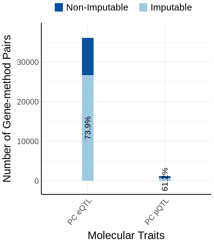
Fig S2-C - KNIGHT#
custom_colors <- c("#E69F00",  # orange
            "#A6CEE3", #light blue
            "#009E73",  # green
            "#B2DF8A",  # light green
            "#0072B2",  # dark blue
            "#FB9A99",
            "#DA70D6", #purple
            "#999999")  # gray
names(custom_colors) <- c("mrash", "susie", "enet", "lasso",  "mrmash", "mvsusie", "bayes_r", "bayes_l")
proportion_by_context_method <- plot_data$supp_fig_2C
# Clustered bar plot
options(repr.plot.width=9.5, repr.plot.height=6.5)
ggplot(proportion_by_context_method, aes(x = context_simp, y = proportion_imputable*100, fill = method)) +
  geom_bar(stat = "identity", position = position_dodge2(padding = 0.25, preserve = "single"),
           width = 0.3)+
  theme_minimal() +
  #theme_cowplot(12) +
  theme(
    axis.text.x = element_text(angle = 50, hjust = 1, size = 15),
    axis.text.y = element_text(size = 15),
    axis.title.x = element_text(size = 21,margin = margin(t = 9)),
    axis.title.y = element_text(size = 21, margin = margin(r = 5)),
    axis.line = element_line(size = 0.7, color = "black"),
    legend.position = "top",
    legend.justification = "right",
    legend.title = element_text(size = 18),
    legend.text = element_text(size = 16),#,
    # legend.spacing.y = unit(8, "pt"),  # increase vertical space between items
    # legend.box.spacing = unit(6, "pt"),
    legend.key.size = unit(8, "pt") #
  ) +
  scale_fill_manual(
      values = custom_colors,
      name = "Methods",
      labels = c(
      "enet"     = "Elastic-net",
      "lasso"    = "Lasso",
      "mrash"    = "mr.ash",
      "susie"    = "SuSiE",
      "mrmash"   = "mr.mash",
      "mvsusie"  = "mvSuSiE",
      "bayes_r"  = "BayesR",
      "bayes_l"  = "BayesL"
      )
    ) +
  labs(
    x = "Molecular Traits",
    y = "Proportion of Imputable Genes(%)",
    fill = "Method"
  )
Warning message:
“The `size` argument of `element_line()` is deprecated as of ggplot2 3.4.0.
ℹ Please use the `linewidth` argument instead.”
Supplementary FigS3 : mega#
Fig S3-A - mega#
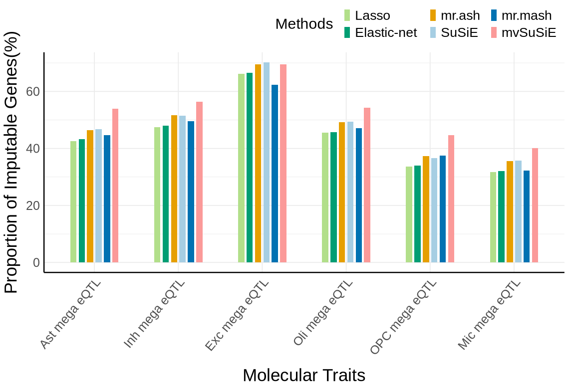
context_order <- c('Ast mega eQTL','Inh mega eQTL', 'Exc mega eQTL','Oli mega eQTL','OPC mega eQTL', 'Mic mega eQTL')
proportion_by_context <- plot_data$supp_fig_3A$proportion_by_context
plot_data_long <- plot_data$supp_fig_3A$plot_data_long
options(repr.plot.width=5.7, repr.plot.height=6.5)

ggplot(plot_data_long, aes(x = Contexts, y = count, fill = type)) +
  geom_bar(stat = "identity", width=0.31) +
    geom_text(
      data = proportion_by_context,
      aes(x = context,
          y = imputable_count / 2,
          label = paste0(round(proportion_imputable * 100, 1), "%")),
      inherit.aes = FALSE,
      size = 5.5, angle=90,
      color = "black"
    )+
  theme_minimal() +
  #theme_cowplot(12) +
  theme(axis.text.x = element_text(angle = 50, hjust = 1, size = 15),
        axis.text.y = element_text(size = 15),
        axis.title.x = element_text(size = 21, margin = margin(t = 9)),
        axis.title.y = element_text(size = 21),
        axis.line = element_line(size = 0.7, color = "black"),# Thicker black axis lines
        legend.title = element_blank(),
        legend.justification = "center",
        legend.margin = margin(b=10),
        legend.text = element_text(size = 18),
        legend.position="top",
        strip.background = element_blank()
        )+
    # scale_fill_brewer(palette = "PuOr", name = "Category",
    #               labels = c("imputable_count" = "Imputable", "non_imputable_count" = "Non-Imputable"))+
    scale_fill_manual(
      values = c("imputable_count" = "#9ecae1", "non_imputable_count" = "#08519c"),
      labels = c("imputable_count" = "Imputable","non_imputable_count" = "Non-Imputable"),
      name = "Category"
    )+
    labs(y = "Number of Genes", x="Molecular Traits", fill = "Category")
Warning message:
“The `size` argument of `element_line()` is deprecated as of ggplot2 3.4.0.
ℹ Please use the `linewidth` argument instead.”
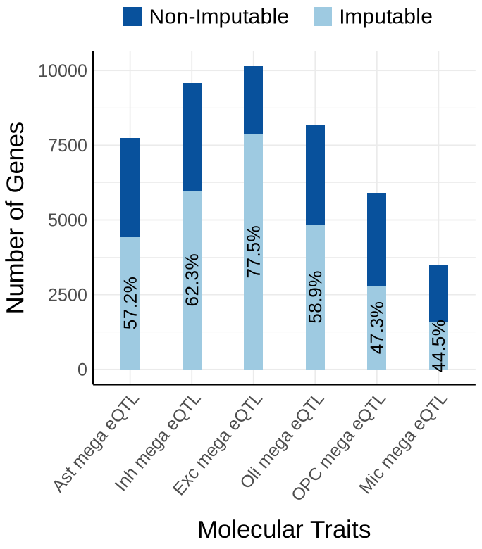
Fig S3-B - mega#
proportion_by_context <- plot_data$supp_fig_3B$proportion_by_context
plot_data_long <- plot_data$supp_fig_3B$plot_data_long
options(repr.plot.width=5.7, repr.plot.height=6.5)
ggplot(plot_data_long, aes(x = Contexts, y = count, fill = type)) +
  geom_bar(stat = "identity", width=0.31) +
  geom_text(
      data = proportion_by_context,
      aes(x = context,
          y = imputable_count / 2,
          label = paste0(round(proportion_imputable * 100, 1), "%")),
      inherit.aes = FALSE,
      size = 5.5, angle=90
    )+
  theme_minimal() +
  #theme_cowplot(12) +
  theme(axis.text.x = element_text(angle = 50, hjust = 1, size = 15),
        axis.text.y = element_text(size = 15),
        axis.title.x = element_text(size = 21, margin = margin(t = 9)),
        axis.title.y = element_text(size = 21), #margin = margin(r = 1)
        axis.line = element_line(size = 0.7, color = "black"),# Thicker black axis lines
        #legend.title = element_text(size = 17),
        legend.title = element_blank(),
        legend.justification = "center",
        legend.margin = margin(b=10),
        legend.text = element_text(size = 18),
        legend.position="top",
        strip.background = element_blank()
        )+
    # scale_fill_brewer(palette = "PuOr", name = "Category",
    #               labels = c("imputable_count" = "Imputable", "non_imputable_count" = "Non-Imputable"))+
    scale_fill_manual(
      values = c("imputable_count" = "#9ecae1", "non_imputable_count" = "#08519c"),
      labels = c("imputable_count" = "Imputable", "non_imputable_count" = "Non-Imputable"),
      name = "Category"
    )+
    labs(y = "Number of Gene-method Pairs", x="Molecular Traits", fill = "Category")
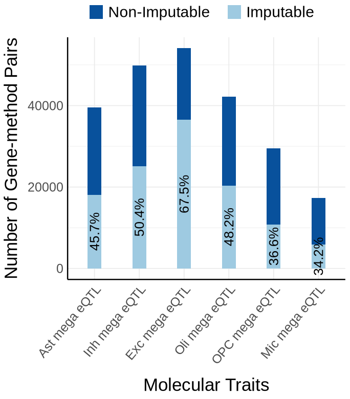
Fig S3-C - mega#
custom_colors <- c("#E69F00",  # orange
            "#A6CEE3", #light blue
            "#009E73",  # green
            "#B2DF8A",  # light green
            "#0072B2",  # dark blue
            "#FB9A99",
            "#DA70D6", #purple
            "#999999")  # gray
names(custom_colors) <- c("mrash", "susie", "enet", "lasso",  "mrmash", "mvsusie", "bayes_r", "bayes_l")
proportion_by_context_method <- plot_data$supp_fig_3C
# Clustered bar plot
options(repr.plot.width=9.5, repr.plot.height=6.5)
ggplot(proportion_by_context_method, aes(x = context, y = proportion_imputable*100, fill = method)) +
  geom_bar(stat = "identity", position = position_dodge2(padding = 0.25, preserve = "single"),width = 0.6)+
  theme_minimal() +
  #theme_cowplot(12) +
  theme(
    axis.text.x = element_text(angle = 50, hjust = 1, size = 15),
    axis.text.y = element_text(size = 15),
    axis.title.x = element_text(size = 21,margin = margin(t = 9)),
    axis.title.y = element_text(size = 21, margin = margin(r = 5)),
    axis.line = element_line(size = 0.7, color = "black"),
    legend.position = "top",
    legend.justification = "right",
    legend.title = element_text(size = 18),
    legend.text = element_text(size = 16),#,
    # legend.spacing.y = unit(8, "pt"),  # increase vertical space between items
    # legend.box.spacing = unit(6, "pt"),
    legend.key.size = unit(8, "pt") #
  ) +
  scale_fill_manual(
      values = custom_colors,
      name = "Methods",
      labels = c(
      "enet"     = "Elastic-net",
      "lasso"    = "Lasso",
      "mrash"    = "mr.ash",
      "susie"    = "SuSiE",
      "mrmash"   = "mr.mash",
      "mvsusie"  = "mvSuSiE",
      "bayes_r"  = "Bayes R",
      "bayes_l"  = "Bayes L"
      )
    ) +
  labs(
    x = "Molecular Traits",
    y = "Proportion of Imputable Genes(%)",
    fill = "Method"
  )
Supplementary FigS4 : MIT#
Fig S4-A - MIT#
proportion_by_context <- plot_data$supp_fig_4A$proportion_by_context
plot_data_long <- plot_data$supp_fig_4A$plot_data_long
options(repr.plot.width=5.7, repr.plot.height=6.5)
label_df <- proportion_by_context %>%
  mutate(
    Contexts = factor(context, levels = context_order),
    total = unique_count,
    label = paste0(round(proportion_imputable * 100, 1), "%"),
    # place label just ABOVE the orange (imputable) part
    y_lab = imputable_count + pmax(50, 0.01 * unique_count)  # small nudge + proportional nudge
  ) %>%
  select(Contexts, y_lab, label, total)
y_max <- max(label_df$total, na.rm = TRUE)
y_top <- y_max * 1.01        # 10% headroom on top
y_bottom <- -0.02 * y_max    # 5% negative space below zero (e.g., -5k if max=100k)
ggplot(plot_data_long, aes(x = Contexts, y = count, fill = type)) +
  geom_bar(stat = "identity", width=0.35) +
    geom_text(
      data = proportion_by_context,
      aes(x = context,
          y = imputable_count / 2 , #- 1000,
          label = paste0(round(proportion_imputable * 100, 1), "%")),
      inherit.aes = FALSE,
      size = 5.5, angle=90,
      color = "black"
    )+
  theme_minimal() +
  coord_cartesian(ylim = c(y_bottom, y_top), clip = "off") +
  theme(axis.text.x = element_text(angle = 50, hjust = 1, size = 15),
        axis.text.y = element_text(size = 15),
        axis.title.x = element_text(size = 21, margin = margin(t = 9)),
        axis.title.y = element_text(size = 21),
        axis.line = element_line(size = 0.7, color = "black"),# Thicker black axis lines
        legend.title = element_blank(),
        legend.justification = "center",
        legend.margin = margin(b=10),
        legend.text = element_text(size = 18),
        legend.position="top",
        strip.background = element_blank()
        )+
    # scale_fill_brewer(palette = "PuOr", name = "Category",
    #               labels = c("imputable_count" = "Imputable", "non_imputable_count" = "Non-Imputable"))+
    scale_fill_manual(
      values = c("imputable_count" = "#9ecae1", "non_imputable_count" = "#08519c"),
      labels = c("imputable_count" = "Imputable","non_imputable_count" = "Non-Imputable"),
      name = "Category"
    )+
    labs(y = "Number of Genes", x="Molecular Traits", fill = "Category")
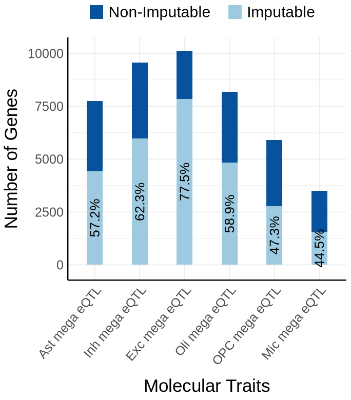
Fig S4-B - MIT#
proportion_by_context <- plot_data$supp_fig_4B$proportion_by_context
plot_data_long <- plot_data$supp_fig_4B$plot_data_long
label_df <- proportion_by_context %>%
  mutate(
    Contexts = factor(context, levels = context_order),
    total = total_count,
    label = paste0(round(proportion_imputable * 100, 1), "%"),
    # place label just ABOVE the orange (imputable) part
    y_lab = imputable_count + pmax(50, 0.02 * total_count)  # small nudge + proportional nudge
  ) %>%
  select(Contexts, y_lab, label, total)

# --- y-axis buffers (tune these once, then forget) ---
y_max <- max(label_df$total, na.rm = TRUE)
y_top <- y_max * 1.05        # 10% headroom on top
y_bottom <- -0.02 * y_max    # 5% negative space below zero (e.g., -5k if max=100k)
options(repr.plot.width=5.7, repr.plot.height=6.5)

ggplot(plot_data_long, aes(x = Contexts, y = count, fill = type)) +
  geom_bar(stat = "identity", width=0.35) +
  geom_text(
      data = proportion_by_context,
      aes(x = context,
          y = imputable_count / 2,
          label = paste0(round(proportion_imputable * 100, 1), "%")),
      inherit.aes = FALSE,
      size = 5.5, angle=90
    )+
  coord_cartesian(ylim = c(y_bottom, y_top), clip = "off") +
  theme_minimal() +
  #theme_cowplot(12) +
  theme(axis.text.x = element_text(angle = 50, hjust = 1, size = 15),
        axis.text.y = element_text(size = 15),
        axis.title.x = element_text(size = 21, margin = margin(t = 9)),
        axis.title.y = element_text(size = 21), #margin = margin(r = 1)
        axis.line = element_line(size = 0.7, color = "black"),# Thicker black axis lines
        #legend.title = element_text(size = 17),
        legend.title = element_blank(),
        legend.justification = "center",
        legend.margin = margin(b=10),
        legend.text = element_text(size = 18),
        legend.position="top",
        strip.background = element_blank()
        )+
    # scale_fill_brewer(palette = "PuOr", name = "Category",
    #               labels = c("imputable_count" = "Imputable", "non_imputable_count" = "Non-Imputable"))+
    scale_fill_manual(
      values = c("imputable_count" = "#9ecae1", "non_imputable_count" = "#08519c"),
      labels = c("imputable_count" = "Imputable", "non_imputable_count" = "Non-Imputable"),
      name = "Category"
    )+
    labs(y = "Number of Gene-method Pairs", x="Molecular Traits", fill = "Category")
Fig S4-C - MIT#
custom_colors <- c("#E69F00",  # orange
            "#A6CEE3", #light blue
            "#009E73",  # green
            "#B2DF8A",  # light green
            "#0072B2",  # dark blue
            "#FB9A99",
            "#DA70D6", #purple
            "#999999")  # gray
names(custom_colors) <- c("mrash", "susie", "enet", "lasso",  "mrmash", "mvsusie", "bayes_r", "bayes_l")
proportion_by_context_method <- plot_data$supp_fig_4C
# Clustered bar plot
options(repr.plot.width=9.5, repr.plot.height=6.5)
ggplot(proportion_by_context_method, aes(x = context, y = proportion_imputable*100, fill = method)) +
  geom_bar(stat = "identity", position = position_dodge2(padding = 0.25, preserve = "single"),
           width = 0.55)+
  theme_minimal() +
  #theme_cowplot(12) +
  theme(
    axis.text.x = element_text(angle = 50, hjust = 1, size = 15),
    axis.text.y = element_text(size = 15),
    axis.title.x = element_text(size = 21,margin = margin(t = 9)),
    axis.title.y = element_text(size = 21, margin = margin(r = 5)),
    axis.line = element_line(size = 0.7, color = "black"),
    legend.position = "top",
    legend.justification = "right",
    legend.title = element_text(size = 18),
    legend.text = element_text(size = 16),#,
    # legend.spacing.y = unit(8, "pt"),  # increase vertical space between items
    # legend.box.spacing = unit(6, "pt"),
    legend.key.size = unit(8, "pt") #
  ) +
  scale_fill_manual(
      values = custom_colors,
      name = "Methods",
      labels = c(
      "enet"     = "Elastic-net",
      "lasso"    = "Lasso",
      "mrash"    = "mr.ash",
      "susie"    = "SuSiE",
      "mrmash"   = "mr.mash",
      "mvsusie"  = "mvSuSiE",
      "bayes_r"  = "BayesR",
      "bayes_l"  = "BayesL"
      )
    ) +
  labs(
    x = "Molecular Traits",
    y = "Proportion of Imputable Genes(%)",
    fill = "Method"
  )
Supplementary FigS5 : sQTL#
Fig S5-A - sQTL#
bar_df <- plot_data$supp_fig_5A$bar_df
plot_data_long <- plot_data$supp_fig_5A$plot_data_long
options(repr.plot.width=5.7, repr.plot.height=6.5)
inner_gap <- 0.25   # distance PR vs UP within a context (smaller = closer)
outer_gap <- 1.10   # distance between contexts (larger = farther apart)
bar_w     <- 0.2
# x-axis ticks: one per context (center between PR and UP)
x_breaks <- bar_df %>%
  group_by(context_simp) %>%
  summarise(x = mean(x), .groups = "drop")
ggplot(plot_data_long,
       aes(x = x, y = count, fill = fill_key, group = context_info)) +
  geom_col(width = bar_w, position = "stack") +
  geom_text(
    data = bar_df,
    aes(
      x = x,
      y = imputable_count / 2,
      label = paste0(round(proportion_imputable * 100, 1), "%")
    ),
    inherit.aes = FALSE,
    size = 5.5, angle = 90
  ) +
  scale_x_continuous(
    breaks = x_breaks$x,
    labels = as.character(x_breaks$context_simp)
  ) +
  scale_fill_manual(
    values = c(
      "PR.imputable_count"      = "#9ecae1","PR.non_imputable_count"  = "#08519c",
      "UP.imputable_count"      = "#a1d99b","UP.non_imputable_count"  = "#006d2c"
    ),
    breaks = c(
      "PR.imputable_count", "PR.non_imputable_count",
      "UP.imputable_count", "UP.non_imputable_count"
    ),
    labels = c(
      "PR.imputable_count"      = "Imputable(PR)",
      "UP.imputable_count"      = "Imputable(UP)",
      "PR.non_imputable_count"  = "Non-Imputable(PR)",
      "UP.non_imputable_count"  = "Non-Imputable(UP)"
    ),
    name = "Imputability"
  ) +
  guides(fill = guide_legend(nrow = 2)) +
  theme_minimal() +
  #theme_cowplot(12) +
  theme(
    legend.position = "top",
    legend.justification = "right",
    legend.text = element_text(size = 14),
    legend.title = element_text(size = 15),
    axis.text.x = element_text(angle = 50, hjust = 1, size = 15),
    axis.text.y = element_text(size = 15),
    axis.title.x = element_text(size = 21, margin = margin(t = 9)),
    axis.title.y = element_text(size = 21),
    axis.line = element_line(size = 0.7, color = "black"),
    strip.background = element_blank()
  ) +
  scale_x_continuous(
      breaks = x_breaks$x,
      labels = as.character(x_breaks$context_simp),
      expand = expansion(mult = c(0.15, 0.15))  # ← add space left, small space right
    )+
  labs(y = "Number of Genes", x = "Molecular Traits")
Scale for x is already present.
Adding another scale for x, which will replace the existing scale.
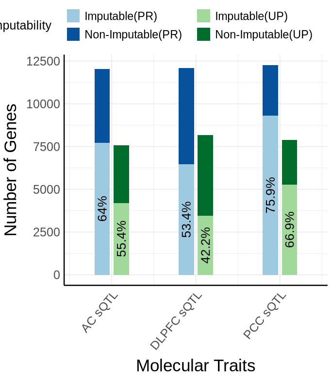
Fig S5-B - sQTL#
inner_gap <- 0.25   # distance PR vs UP within a context (smaller = closer)
outer_gap <- 1.10   # distance between contexts (larger = farther apart)
bar_w     <- 0.2
bar_df <- plot_data$supp_fig_5B$bar_df
plot_data_long <- plot_data$supp_fig_5B$plot_data_long
# x-axis ticks: one per context (center between PR and UP)
x_breaks <- bar_df %>%
  group_by(context_simp) %>%
  summarise(x = mean(x), .groups = "drop")
options(repr.plot.width=5.7, repr.plot.height=6.5)
ggplot(plot_data_long,
       aes(x = x, y = count, fill = fill_key, group = context_info)) +
  geom_col(width = bar_w, position = "stack") +
  geom_text(
    data = bar_df,
    aes(
      x = x,
      y = imputable_count / 2,
      label = paste0(round(proportion_imputable * 100, 1), "%")
    ),
    inherit.aes = FALSE,
    size = 5, angle = 90
  ) +
  scale_x_continuous(
    breaks = x_breaks$x,
    labels = as.character(x_breaks$context_simp)
  ) +
  scale_fill_manual(
    values = c(
      "PR.imputable_count"      = "#9ecae1","PR.non_imputable_count"  = "#08519c",
      "UP.imputable_count"      = "#a1d99b","UP.non_imputable_count"  = "#006d2c"
    ),
    breaks = c(
      "PR.imputable_count", "PR.non_imputable_count",
      "UP.imputable_count", "UP.non_imputable_count"
    ),
    labels = c(
      "PR.imputable_count"    = "Imputable(PR)",     "UP.imputable_count"    = "Imputable(UP)",
      "PR.non_imputable_count"= "Non-Imputable(PR)", "UP.non_imputable_count"= "Non-Imputable(UP)"
    ),
    name = "Imputability"
  ) +
  guides(fill = guide_legend(nrow = 2)) +
  theme_minimal() +
  #theme_cowplot(12) +
  theme(
    legend.position = "top",
    legend.justification = "right",
    legend.text = element_text(size = 14),
    legend.title = element_text(size = 15),
    axis.text.x = element_text(angle = 50, hjust = 1, size = 15),
    axis.text.y = element_text(size = 15),
    axis.title.x = element_text(size = 21, margin = margin(t = 9)),
    axis.title.y = element_text(size = 21),
    axis.line = element_line(size = 0.7, color = "black"),
    strip.background = element_blank()
  ) +
  scale_x_continuous(
      breaks = x_breaks$x,
      labels = as.character(x_breaks$context_simp),
      expand = expansion(mult = c(0.15, 0.15))  # ← add space left, small space right
    )+
  scale_y_continuous(labels = scales::label_comma()) +
  labs(y = "Number of Gene-method Pairs", x = "Molecular Traits")
Scale for x is already present.
Adding another scale for x, which will replace the existing scale.
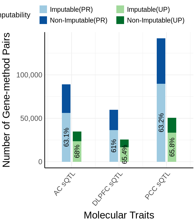
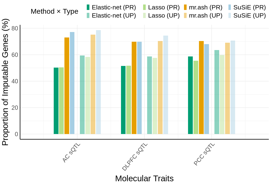
Fig S5-C - sQTL#
custom_colors <- c("#E69F00",  # orange
            "#A6CEE3", #light blue
            "#009E73",  # green
            "#B2DF8A",  # light green
            "#0072B2",  # dark blue
            "#FB9A99",
            "#DA70D6", #purple
            "#999999")  # gray
names(custom_colors) <- c("mrash", "susie", "enet", "lasso",  "mrmash", "mvsusie", "bayes_r", "bayes_l")
context_order <- plot_data$supp_fig_5C$context_order
proportion_by_context_method <- plot_data$supp_fig_5C$proportion_by_context_method
plot_df <- plot_data$supp_fig_5C$plot_df
custom_colors_type_method <- plot_data$supp_fig_5C$custom_colors_type_method
context_gap     <- 1    # space between contexts (AC vs DLPFC vs PCC)
type_gap        <- 0.28    # base separation between PR and UP clusters
type_extra_gap  <- 0.11   # EXTRA space between PR block and UP block within a context
method_gap      <- 0.08   # space between methods within each type block
bar_w           <- 0.07   # bar width

type_levels   <- c("PR","UP")
method_levels <- c("enet","lasso","mrash","susie")
method_order <- c("lasso", "enet", "bayes_l", "bayes_r", "mrash", "susie", "mrmash", "mvsusie")
context_levels <-  context_order
options(repr.plot.width=9.5, repr.plot.height=6.5)
## ---- labels for legend ----
legend_labels <- c(
  "enet.PR"  = "Elastic-net (PR)",
  "enet.UP"  = "Elastic-net (UP)",
  "lasso.PR" = "Lasso (PR)",
  "lasso.UP" = "Lasso (UP)",
  "mrash.PR" = "mr.ash (PR)",
  "mrash.UP" = "mr.ash (UP)",
  "susie.PR" = "SuSiE (PR)",
  "susie.UP" = "SuSiE (UP)"
)
x_breaks <- plot_df %>%
  group_by(context_simp) %>%
  summarise(x = mean(x), .groups = "drop")

## ---- plot ----
options(repr.plot.width = 9.5, repr.plot.height = 6.5)

ggplot(plot_df,
       aes(x = x,
           y = proportion_imputable * 100,
           fill = type_method)) +

  geom_col(width = bar_w) +

  scale_x_continuous(
    breaks = x_breaks$x,
    labels = as.character(x_breaks$context_simp),
    expand = expansion(add = c(0.5, 0.5))
  ) +

  scale_fill_manual(
    values = custom_colors_type_method,
    labels = legend_labels,
    name = "Method × Type"
  ) +

  scale_y_continuous(labels = scales::label_number(accuracy = 1)) +

  theme_minimal() +
  #theme_cowplot(12) +
  theme(
    axis.text.x = element_text(angle = 50, hjust = 1, size = 15),
    axis.text.y = element_text(size = 15),
    axis.title.x = element_text(size = 21, margin = margin(t = 9)),
    axis.title.y = element_text(size = 21),
    axis.line = element_line(size = 0.7, color = "black"),
    legend.position = "top",
    legend.justification = "right",
    legend.title = element_text(size = 18),
    legend.text = element_text(size = 16),
    legend.key.size = unit(8, "pt")
  ) +

  labs(
    x = "Molecular Traits",
    y = "Proportion of Imputable Genes (%)",
    fill = "Method × Type"
  )
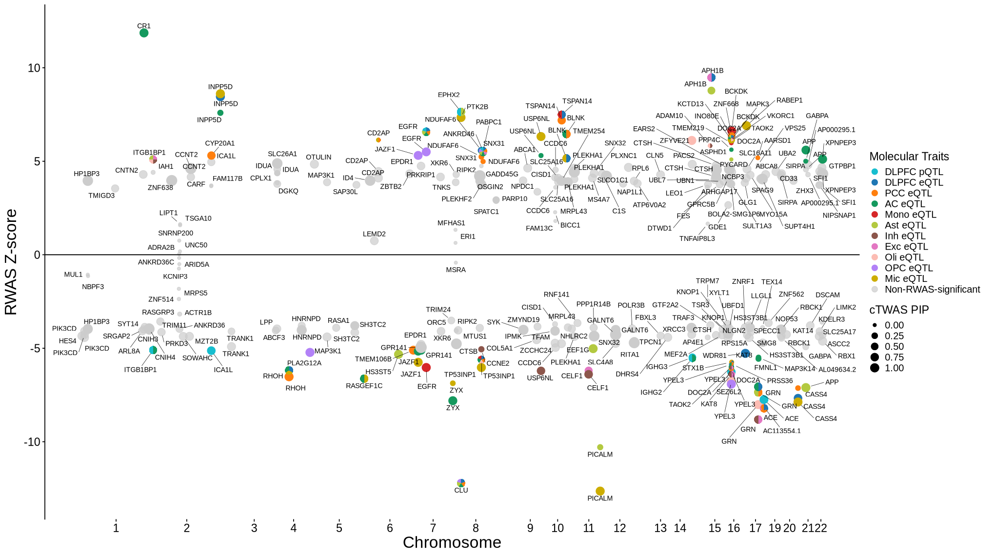
Supplementary FigS6 : RWAS Z score filtered by single group cTWAS prioritization#
library(colorspace)
library(scatterpie)
library('ggnewscale')
thr <- -log10(0.05 / 73874)
eps <- 0.15
context_colors <- c(
  'DLPFC_Bennett_pQTL'     = "#17becf",  # teal
  'DLPFC_DeJager_eQTL'     = "#1f77b4",  # blue
  'PCC_DeJager_eQTL'       = "#ff7f0e",  # orange
  'AC_DeJager_eQTL'        = "#15995e",  # green
  'monocyte_ROSMAP_eQTL'   = "#d62728",  # red
  #'Ast_DeJager_eQTL'       = "#d2de52",  # light olive
  'Ast_DeJager_eQTL'       = "#b3c940",
  'Inh_DeJager_eQTL'       = "#8c564b",  # brown
  'Exc_DeJager_eQTL'       = "#e377c2",  # pink
  'Oli_DeJager_eQTL'       = "#fcbcb3",  # light pink
  'OPC_DeJager_eQTL'       = "#b281f7",  # purple
  'Mic_DeJager_eQTL'       = "gold3"     # magenta
)
names(context_colors) <- gsub("_DeJager_|_ROSMAP_|_Bennett_", " ", names(context_colors))
names(context_colors) <- gsub("monocyte", "Mono",names(context_colors))
base_df <- plot_data$supp_fig_6$base_df
pie_df_nonsig <- plot_data$supp_fig_6$pie_df_nonsig
pie_df_sig <- plot_data$supp_fig_6$pie_df_sig
axis_chr <- plot_data$supp_fig_6$axis_chr
pie_cols <- plot_data$supp_fig_6$pie_cols
label_df <-  plot_data$supp_fig_6$label_df
options(repr.plot.width = 17, repr.plot.height = 9.5)
nonsig_label <- "Non-RWAS-significant"

ggplot() +
  ## base grey (RWAS non-significant)
  geom_point(
    data = subset(base_df, -log10(twas_pval) < thr),
    aes(
      x = BPplot,
      y = twas_z,
      size = susie_pip,
      color = nonsig_label
    ),
    alpha = 0.7
  ) +

  ## base colored (RWAS significant)
  geom_point(
    data = subset(base_df, -log10(twas_pval) >= thr),
    aes(
      x = BPplot,
      y = twas_z,
      color = context_simp,
      size = susie_pip
    ),
    alpha = 1
  ) +

  ## pie clusters: NON-significant -> grey circle only
  geom_point(
    data = pie_df_nonsig,
    aes(x = BPplot, y = twas_z),
    shape = 21,
    fill = "grey80",
    color = "grey80",
    size = pie_df_nonsig$r * 26.5,
    inherit.aes = FALSE,
    show.legend = FALSE
  ) +

  ## pie clusters: significant -> colored pies
  scatterpie::geom_scatterpie(
    data = pie_df_sig,
    aes(x = BPplot, y = twas_z, r = r),
    cols = pie_cols,
    show.legend = FALSE,
    color = NA,
    alpha = 1
  ) +

  scale_size_continuous(
    name = "cTWAS PIP",
    range = c(1.5, 4.5),
    limits = c(0, 1)
  ) +

  scale_color_manual(
    values = c(
      context_colors,
      setNames("grey80", nonsig_label)
    ),
    breaks = c(names(context_colors), nonsig_label),
    limits = c(names(context_colors), nonsig_label),
    drop = FALSE,
    name = "Molecular Traits"
  ) +

  scale_fill_manual(
    values = context_colors,
    breaks = names(context_colors),
    limits = names(context_colors),
    drop = FALSE,
    name = "Molecular Traits"
  ) +

  scale_x_continuous(labels = axis_chr$chr, breaks = axis_chr$centerPlot) +

  geom_text_repel(
    data = label_df,
    aes(x = BPplot, y = twas_z, label = gene_name),
    nudge_y = ifelse(label_df$twas_z >= 0, 0.25, -0.25),
    color = "black",
    box.padding = 0.3,
    point.padding = 0.8,
    segment.size = 0.2,
    max.overlaps = Inf,
    size = 3,
    show.legend = FALSE
  ) +

  geom_hline(yintercept = 0) +
  labs(x = "Chromosome", y = "RWAS Z-score") +
  theme_bw() +
  theme_cowplot(12) +
  theme(
    panel.border = element_blank(),
    axis.line = element_line(),
    axis.line.x = element_blank(),
    panel.grid.major = element_blank(),
    panel.grid.minor = element_blank(),
    plot.title = element_blank(),
    axis.title = element_text(size = 20),
    axis.text  = element_text(size = 14),
    legend.title = element_text(size = 14),
    legend.text  = element_text(size = 12)
  ) +

  guides(
    color = guide_legend(
      override.aes = list(size = 3),
      order = 1
    ),
    fill = guide_legend(
      override.aes = list(size = 4),
      order = 1
    ),
    size = guide_legend(order = 2)
  )
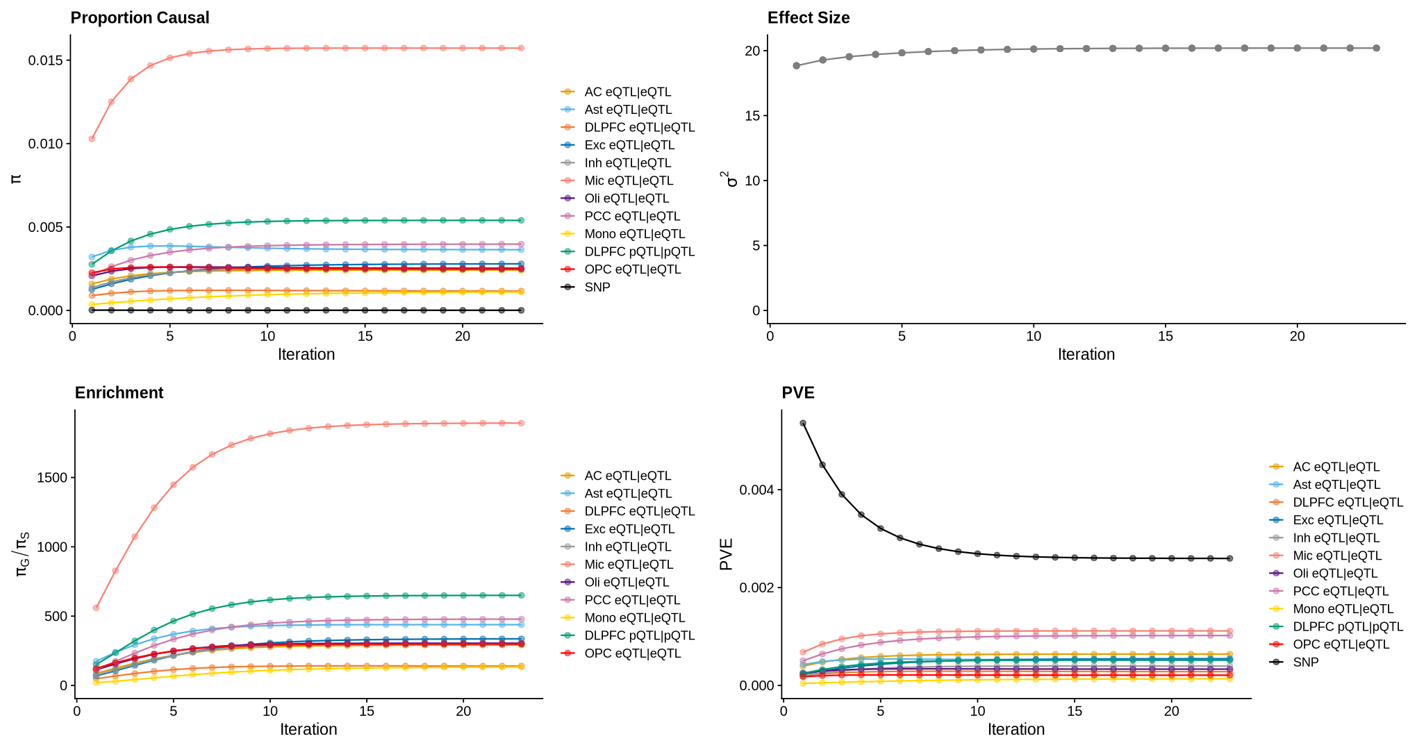
Supplementary FigS7: m-ctwas parameter convergence#
library(ctwas)
library(ggplot2)
library(cowplot)
allgwas <- plot_data$supp_fig_7$allgwas
custom_colors <- plot_data$supp_fig_7$custom_colors
all(names(allgwas[[1]]) %in% names(custom_colors))
TRUE
gwas_n <- 111326+677663 # gwas n (sample size)
options(repr.plot.width=17, repr.plot.height=9)
make_convergence_plots(allgwas, gwas_n= gwas_n, title.size = 14, legend.size = 11, colors = custom_colors)
Warning message:
"No shared levels found between `names(values)` of the manual scale and the data's colour values."
Warning message:
"No shared levels found between `names(values)` of the manual scale and the data's colour values."
Warning message:
"No shared levels found between `names(values)` of the manual scale and the data's colour values."
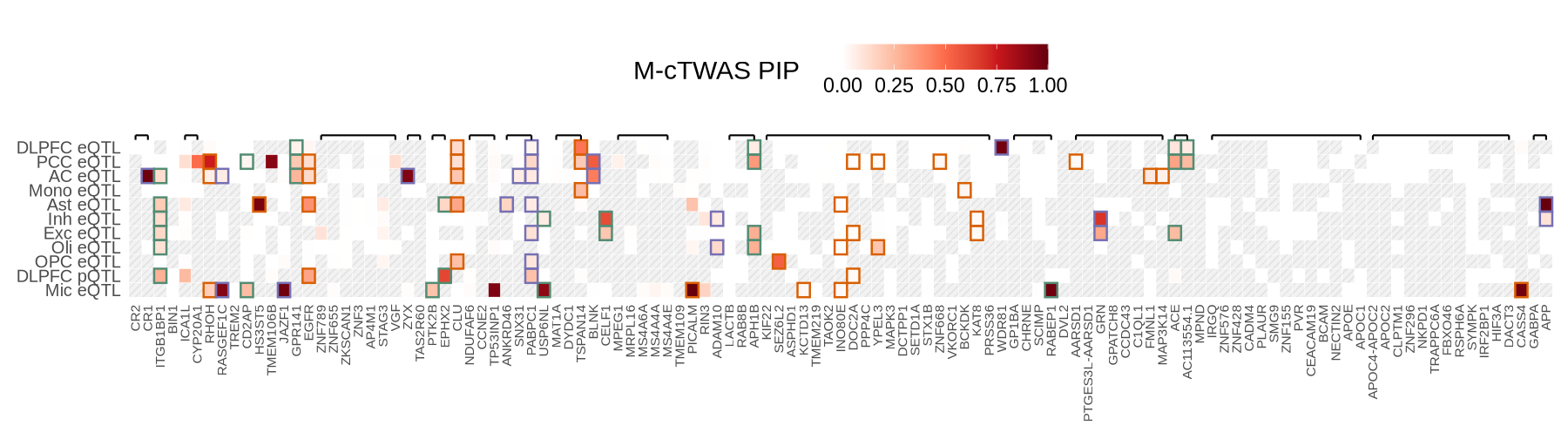
Supplementary FigS8: m-ctwas heatmap#
source("plot_pip_heatmap.R")
library(ggpattern)
options(repr.plot.width=15, repr.plot.height=3.8)
wide_df <- plot_data$supp_fig_8$wide_df
ctwas_mrs_update <- plot_data$supp_fig_8$ctwas_mrs_update
tss_df <- plot_data$tss_df
region_ls <- plot_data$supp_fig_8$region_ls
options(repr.plot.width=15, repr.plot.height=4.2)
plot_pip_heatmap(wide_df, tss_df, ctwas_mrs_update, region_ls)
Warning message:
"There was 1 warning in `mutate()`.
ℹ In argument: `chr_idx = case_when(...)`.
Caused by warning:
! NAs introduced by coercion"
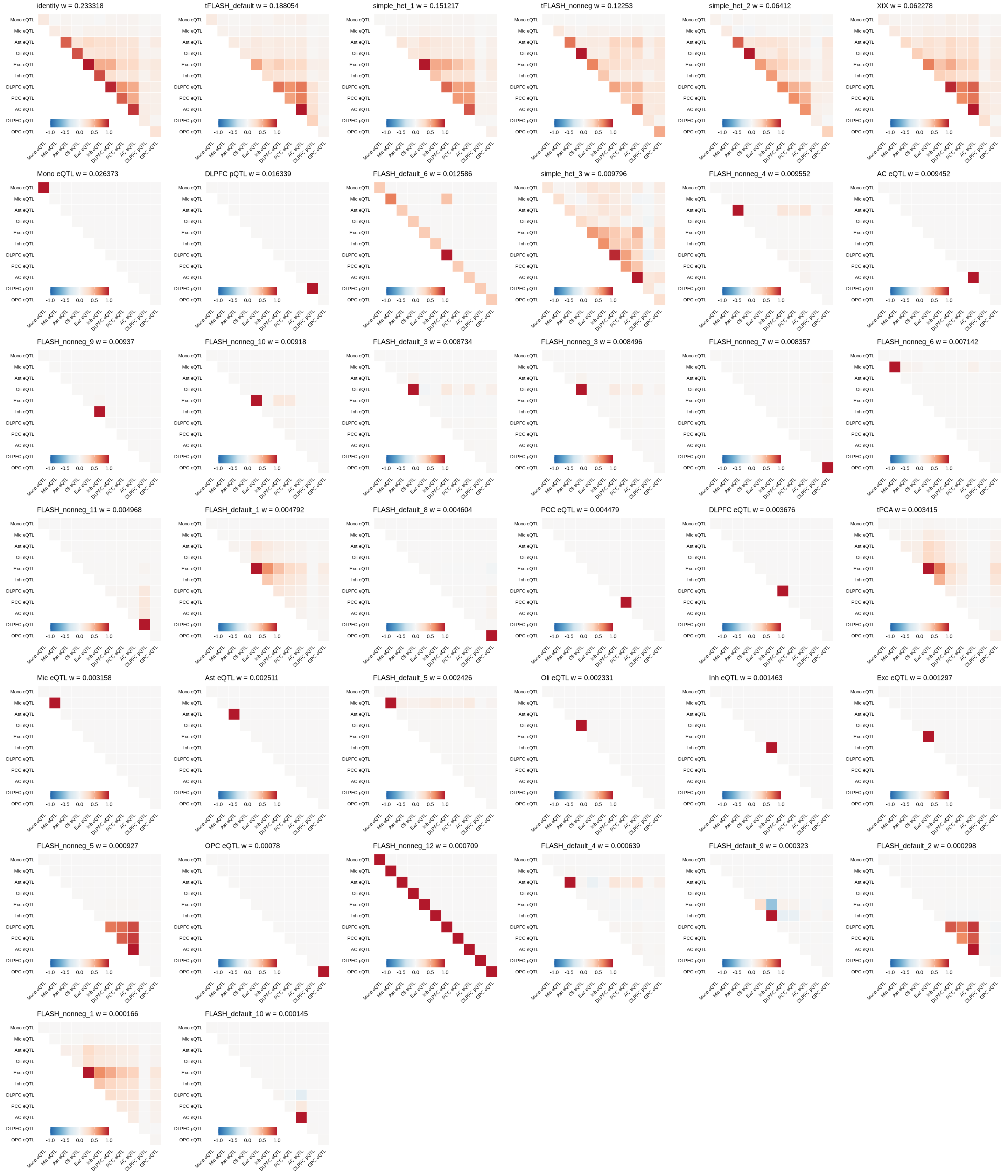
Supplementary FigS9: mixture prior patterns#
library(gridExtra)
library(mashr)
library("reshape2")
dat <- plot_data$supp_fig_9
# update plot_sharing
plot_sharing = function(X, col = 'black', to_cor=FALSE, title="", remove_names=F) {
        clrs <- colorRampPalette(rev(c("#B2182B", "#EF8A62", "#FDDBC7", "#F7F7F7",
            "#D1E5F0", "#67A9CF", "#2166AC")))(128)
        # clrs <- colorRampPalette(rev(c("#D73027","#FC8D59","#FEE090","#FFFFBF",
        #     "#E0F3F8","#91BFDB","#4575B4")))(128)
        if (to_cor) lat <- cov2cor(X)
        else lat = X/max(diag(X))
        lat[lower.tri(lat)] <- NA
        n <- nrow(lat)
        if (remove_names) {
            colnames(lat) = paste('t',1:n, sep = '')
            rownames(lat) = paste('t',1:n, sep = '')
        }
        melted_cormat <- melt(lat[n:1,], na.rm = TRUE)
        p = ggplot(data = melted_cormat, aes(Var2, Var1, fill = value))+
            geom_tile(color = "white")+ggtitle(title) +
            scale_fill_gradientn(colors = clrs, limit = c(-1,1), space = "Lab") +
            theme_minimal()+
            coord_fixed() +
            theme(axis.title.x = element_blank(),
                  axis.title.y = element_blank(),
                  axis.text.x = element_text(color=col, size=8,angle=45,hjust=1),
                  axis.text.y = element_text(color=rev(col), size=8),
                  title =element_text(size=10),
                  panel.grid.major = element_blank(),
                  panel.border = element_blank(),
                  panel.background = element_blank(),
                  axis.ticks = element_blank(),
                  legend.justification = c(1, 0),
                  legend.position = c(0.6, 0),
                  legend.direction = "horizontal")+
            guides(fill = guide_colorbar(title="", barwidth = 7, barheight = 1,
                   title.position = "top", title.hjust = 0.5))
        if(remove_names){
            p = p + scale_x_discrete(labels= 1:n) + scale_y_discrete(labels= n:1)
        }
        return(p)
    }
calculate_proportion = function(X, col = 'black', to_cor=FALSE, title="", remove_names=F) {
        if (to_cor) lat <- cov2cor(X)
        else lat = X/max(diag(X))
        lat[lower.tri(lat)] <- NA

        return(lat)
    }
    meta <- data.frame(names(dat$U), dat$w, stringsAsFactors = F)
    colnames(meta) <- c("U", "w")
    tol <- 1E-6
    n_comp <- length(meta$U[which(meta$w > tol)])
    meta <- head(meta[order(meta[, 2], decreasing = T), ], nrow(meta))
    message(paste(n_comp, "components out of", length(dat$w), "total components have weight greater than", tol))
    res <- list()
    res2 <- list()
    options(repr.plot.width = 24, repr.plot.height = 4 * ceiling(n_comp / 6))

    for (i in 1:n_comp) {
        title <- paste(meta$U[i], "w =", round(meta$w[i], 6))
        if (is.list(dat$U[[meta$U[i]]])) {
            res[[i]] <- plot_sharing(dat$U[[meta$U[i]]]$mat, to_cor = F, title = title, remove_names = FALSE)
            res2[[i]] <- calculate_proportion(dat$U[[meta$U[i]]]$mat, to_cor = F, title = title, remove_names = FALSE)
            names(res2)[[i]] <- meta$U[[i]]
        } else if (is.matrix(dat$U[[meta$U[i]]])) {
            res[[i]] <- plot_sharing(dat$U[[meta$U[i]]], to_cor = F, title = title, remove_names = FALSE)
            res2[[i]] <- calculate_proportion(dat$U[[meta$U[i]]], to_cor = F, title = title, remove_names = FALSE)
            names(res2)[[i]] <- meta$U[[i]]
        }
    }
    unit <-4
    n_col <- 6
    n_row <- ceiling(n_comp / n_col)

    res3 <- ls()
    for (i in 1:length(res2)) {
        res2[[i]][res2[[i]] < 0.32] <- 0
        res2[[i]][is.na(res2[[i]])] <- 0
        res3[[i]] <- sum(res2[[i]] > 0)
        names(res3)[[i]] <- names(res2)[[i]]
    }
    singleton <- round(sum(dat$w[names(res3)[res3 == 1]]), 4)
    doubleton <- round(sum(dat$w[names(res3)[res3 == 2]]), 4)

    do.call(gridExtra::grid.arrange, c(res, list(ncol = n_col, nrow = n_row)))
38 components out of 38 total components have weight greater than 1e-06